Showing posts with label BRIEF 1 (magazine covers). Show all posts

Friday, 9 December 2011

G2 fold out posters,

These are the ones I have decided to go with,


PHOTOGRAPHS


I have printed these on black and white in the mac suites, so the stock isn't the correct stock. They would be printed onto A2 bulky newsprint, but due to size limitations and no more manual feed I just had to settle with A3 white paper. I also needed to print through the lasers so the foil blocking could work. 

I foil blocked the posters to give them a special sort of feel/look, they can also be printed in bulk so they could easily be mass produced. I have also proposed a recycled paper (bulky newsprint) to support the overall message of the articles, and ink levels are low. 

I want the poster to have a sense of speciality about it, so the receiver doesn't just ignore it/put it in the bin. 

Saturday, 26 November 2011

FOUR BRIEFS PRINTED

£28.30 of print,
- Book brief (minus bookmarks and stickers)
- NPG
- Guardian (minus fold outs)
- Elliott M LP covers

I printed the book brief onto cartridge paper because I wanted them to look a bit more textured, rather than just flat colours, the colours didn't look as authentic then when printed onto a slightly off white/textured paper. I am happy with how these turned out.

Guardian was printed onto Antique White, these are the front cover prints for display only. I think the solid different shades of blue sit well on the paper. I now just need to print posters in the mac suite so I am able to foil block them.

National Portrait was printed onto matt (I was unable to print double sided satin so I printed the range off on matt paper). My booklet was printed onto thin matt, I am happy with the layout, however as always there some mistakes I noticed AFTER it had printed, so I will mention these in my evaluation. I hope it looks professional once I have put it together, I just hope the print quality and binding doesn't let it down.

Elliott M LP covers - I printed two off, just to show scale at which they could be printed (these are also more for display, proper pdfs will be blogged). I like how these have turned out, and definitely think the black really helps the logo and colour variation stand out.

I now need to fold them all into their products and photograph them for presentation boards.


Wednesday, 23 November 2011

g2 - poster fold outs,

I am REALLY struggling with these fold outs, I think it's because I'm trying to keep them appropriate to the target audience as well as purposeful. I wanted them to have information on them that would make the posters have more of a purpose, however, I keep on trying to make them too creative??


I chose a layout I quite liked and put it as the range:


I want to foil block the pattern, to give the poster a bit of depth/edge to it?? Is this process appropriate, too expensive?

PRINT PREP

PDFs for 3 briefs I am printing on Thursday:

BOOK BRIEF

Wrapping Paper (printed onto tracing paper)


Stickers and Book marks (printed onto cartridge paper)


Chocolate wrappers (printed onto cartridge paper)


Book covers (printed onto cartridge paper)


NATIONAL PORTRAIT GALLERY

Leaflet (printed onto satin)


Ticket casing (male and female) (printed onto satin)


Tickets (male and female) (printed onto matt)


Booklet (postscript format) (printed onto satin)


G2 BRIEF 

Prints (front covers only) (printed onto antique white)


Cover spreads (these won't be printed but pdf is prepped as if it were being sent to printers) (paper specified)


Fold outs (printed onto bulky newsprint)

COMING SOON


Monday, 14 November 2011

G2 magazine - fold out poster,

I have decided to make the fold out poster a little more exclusive.
I want to try foil blocking the pattern, outlined image onto newsprint. Here is some development into layout:


The poster will have a front and back, both sides foil blocked. 
If I include text, the text will be in the appropriate colour, not foil. I want to pattern/image to be separated from the text so I don't think it should be foil blocked.


-   -

Thursday, 10 November 2011

g2 covers - final experiments,


off white


experimenting with turtle cover, different colours and density of pattern :


Wednesday, 9 November 2011

g2 slip in posters - experimenting,

I want to design and produce a slip in poster that will also be available in the Saturday edition of the Guardian (full pack). There will be four, one for each week and I want to try and include facts and bullet points to help prevent the specific cause of marine threat that is appropriate to that week's edition. 
Here is where I left off, first design idea:


Monday, 7 November 2011

g2 - working on new magazine covers,

The image more within a context, testing out type layout. 
I like this idea of the type being placed in a random but also systematic way.


The set of four, at this stage...

Friday, 4 November 2011

magazine covers, trying new imagery/concepts

I have tried a new approach, I want to use shapes and representation of what I am trying to communicate, through a less obvious way. 

I want to use different shapes and lines to create different representations of the ocean, but with hints of their specific message involved within the image.

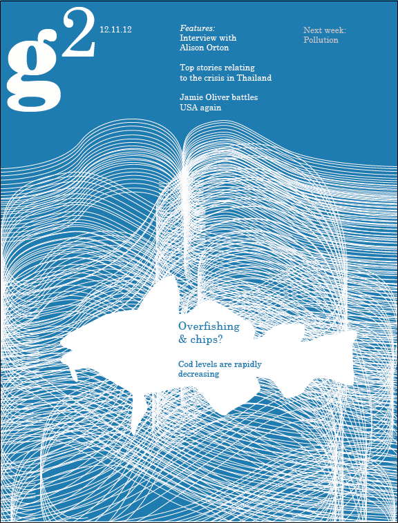
Here I am involving a net/tangled version of the sea, to show the catching of fish, entrapment. 
The white silhouette of the fish represents the gap. I am thinking of having all of the covers with some sort of white shape, that relates to the topic.

Another representation of the sea, but with a hint of cloud/smokey pollution. The circular shape representing the 'gap in the ocean', but also having this repetition of shapes.

A series of waves, that appear more as layers overlapping. The ocean but as it overflowing, flooding the house, expressing how sea levels are rising.

--------------------------------------
 the 4th topic is to communicate how there is excessive growth of dense algal mats which blanket the seabed and foreshore. I thought I could manipulate the actual pattern to help communicate the toxic sea bed:

 
I have played around with the anchor points to make the swirls more edgey/jagged. I need a shape though,
one of the causes of the toxic algae that is covering the sea bed, is that it is causing environments and habitats to deteriorate, which is killing off species, including sea turtles.


These still need development, and I am thinking about maybe producing different series? I also want to think about considering these more within the magazine layout/context, and also how each issue could be a different shade of blue. I want to keep the colours blue to help communicate the series being all focused around marine threats.

Wednesday, 19 October 2011

g2 - weight loss

This was an idea I thought up and drafted in my sketchbook. I have been thinking of the copies as yearly issues (I still havent decided how many covers I should do), but if I was to work my creating each cover through a theme of the particular month then this was an idea for January. Popular January topics were New Years Resolutions and Weight Loss (after Christmas chub). I thought about interacting with the page itself, similar to what I did with the Simpson issue. The idea that the magazine itself is being squeezed and held together by a measuring tape, representation of wanting to lose weight?


I wasn't sure whether to have the lines representing the scrunched up paper, illustrated in a similar way to the tape measure or vectored (see below)

More subtle vectored lines... doesn't work

I tried producing a scrunched up paper effect in Photoshop, after numerous attempts this was the only one that looked slightly like scrunched up paper and the folds didn't appear in the right place. It also was impossible to create the folds where you wanted them through producing random strikes with the gradient tool...

I decided to do it by hand. Scanned in image of paper screwed up by the sides

The tape seems to much like an overlay, lies to flatly on top. 
I think the whole image being illustrated in the same style works best.

Initial colour variations, seeing how the image works alongside text.


Tuesday, 18 October 2011

g2 - simpsons issue development

This was an idea of for a random month, some months fell under no direct theme so I thought it could be a time to play around with ideas. I thought about how it would be interesting to know who was behind the Simpsons characters. An idea I have played around with:

 I was influence by a visiting professional Robbie Porter, one of the pieces of work he had produced that I really liked was where he had the edge of the page folding up. I thought this could be a good way to show what could be underneath? What is behind Homer's face?
Sketching out Homer (quite difficult to make exact simpsons look, but I thought I wanted it to look a bit like my illustration style so that at the end the covers all work as a set?)


Once scanned in I started to play around with adding the corner peeling off:
Adding type, experimenting with layout, the yellow colour is the exact Simpsons hex - FECB00


Once I felt a type layout and text I felt worked enough for now, I began to explore the image further.

Longer, more drawn out fold, where Homer is also smaller.
Type coming out further towards image,
I felt that the folds weren't looking realistic enough... after playing around with image size, text layout, fold size, I decided to try producing a fold on illustrator.
This fold was produced on illustrator, its a white triangle with curved angles, with a grey shading/line on two of the sides. I feel this one works a lot better now that it looks a little more like a curve, and it's also more subtle so the drawing is the main focus.