Showing posts with label BRIEF 3 - NATIONAL PORTRAIT GALLERY. Show all posts

Saturday, 26 November 2011

FOUR BRIEFS PRINTED

£28.30 of print,
- Book brief (minus bookmarks and stickers)
- NPG
- Guardian (minus fold outs)
- Elliott M LP covers

I printed the book brief onto cartridge paper because I wanted them to look a bit more textured, rather than just flat colours, the colours didn't look as authentic then when printed onto a slightly off white/textured paper. I am happy with how these turned out.

Guardian was printed onto Antique White, these are the front cover prints for display only. I think the solid different shades of blue sit well on the paper. I now just need to print posters in the mac suite so I am able to foil block them.

National Portrait was printed onto matt (I was unable to print double sided satin so I printed the range off on matt paper). My booklet was printed onto thin matt, I am happy with the layout, however as always there some mistakes I noticed AFTER it had printed, so I will mention these in my evaluation. I hope it looks professional once I have put it together, I just hope the print quality and binding doesn't let it down.

Elliott M LP covers - I printed two off, just to show scale at which they could be printed (these are also more for display, proper pdfs will be blogged). I like how these have turned out, and definitely think the black really helps the logo and colour variation stand out.

I now need to fold them all into their products and photograph them for presentation boards.


Wednesday, 23 November 2011

PRINT PREP

PDFs for 3 briefs I am printing on Thursday:

BOOK BRIEF

Wrapping Paper (printed onto tracing paper)


Stickers and Book marks (printed onto cartridge paper)


Chocolate wrappers (printed onto cartridge paper)


Book covers (printed onto cartridge paper)


NATIONAL PORTRAIT GALLERY

Leaflet (printed onto satin)


Ticket casing (male and female) (printed onto satin)


Tickets (male and female) (printed onto matt)


Booklet (postscript format) (printed onto satin)


G2 BRIEF 

Prints (front covers only) (printed onto antique white)


Cover spreads (these won't be printed but pdf is prepped as if it were being sent to printers) (paper specified)


Fold outs (printed onto bulky newsprint)

COMING SOON


Thursday, 17 November 2011

NPG - considering designs in context&format,

I want to put this brief to bed.

Landscape layout, suitable for billboards/buses?


Considering designs within a context, below:
 - portrait layout within bus stop case
- portrait layout as banners outside of the gallery
- landscape layout suitable for billboard use

Wednesday, 9 November 2011

Npg - developing contents of booklet,

I want to explore the use of using randomly positioned text/images, but with more of a hidden structure:


I want to have multiple collums that enable me to place text/image in what would seem like a random position, but also have a neatness to the overall layout. I have also experimented with having the text box shape relevant to the shape of the image opposite. I want the reasons I am producing this specific layout to seem, not obvious, but somehow seems structural.


I have added photographs and actual text to the booklet, the pages I am more concerned about are the ones with the photographs on, they seem like they lack structure? I also don't like the captions, I don't think I should include any text.

The lines are placed quite specifically, they represent what could be quite iconic about the person, e.g Hitler (points to his mustache), Jimi (his hair), they're not perfect concepts but it gave be a some rules when organising where they could go, once again, this idea of looking random but there is a hidden message.


I have neatened up the booklet, making everything is in a grid, and have also taken away the text on the pages which had photographs on. I felt they worked well as just self explanatory, most of the captions were unnecessary and I thought they cluttered up the neat look I was going for:


Monday, 7 November 2011

NPG - starting leaflet

I want to produce a leaflet that will be available to take at the ticket counter at the entrance of the gallery. It will just be a brief introduction into the exhibition, highlighting key information and novelty facts.


Starting off the layout, the leaflet will fold in 2 areas, giving me a total of 3 pages.


NPG - starting booklet

I have decided that I want to design and produce a booklet that could be sold either at the gift shop, or at the ticket desk. It will contain a small amount of information of some of the featured portraits in the exhibition, (small biography, trivia), there will also be other photographs of them throughout the publication. In terms of me as a designer, I wouldn't place myself in this area of producing a booklet (type and layout), however, I wanted to challenge myself, I also think this piece is appropriate for my overall package regarding this brief.

First attempt :


Thursday, 3 November 2011

Working further on NPG posters,


Balancing out the information, 'squaring up' the text at the top to try and make all the type aligned.

Tuesday, 1 November 2011

NPG - developing ticket design,

I had an idea inspired from a piece of design context, where the ticket is encased within a small package. I thought this was would work because I want to separate the image from the type. I also like the idea of the text being wrapped by the image.


Thursday, 20 October 2011

NPG - exhibition 'Iconic' logo thought,

I have recently decided that the promotional work I have been working on for the National Portrait Gallery are now going to be promoting, more specifically, a made-up exhibition called, 'Iconic'. This exhibition explores the portraits and lives of some of the most Iconic faces.
Here are some logos I have started developing for it. I want it to just be a simple type logo that can easily be inverted to be white (if needed). I am playing around with the typefaces, layout of type and incorporating the 'infinity' logo into the letters.


Monday, 17 October 2011

NPG - trying new taglines,


After having a talk with Lorenzo and Joe, we came to the conclusion that the tagline 'It Can Only Be' wasn't working. Lorenzo suggested using actual quotes/facts about each individual instead. I felt this would be successful, the idea behind the image overall was to get viewers drawn to by the blurred face, and an interesting fact about each face could greater the enthusiasm to want to go to the exhibition even more.


Here are some facts I researched for Marilyn, testing out on design,


(italic?)


Jimi Hendrix - chosen fact from research I did already,
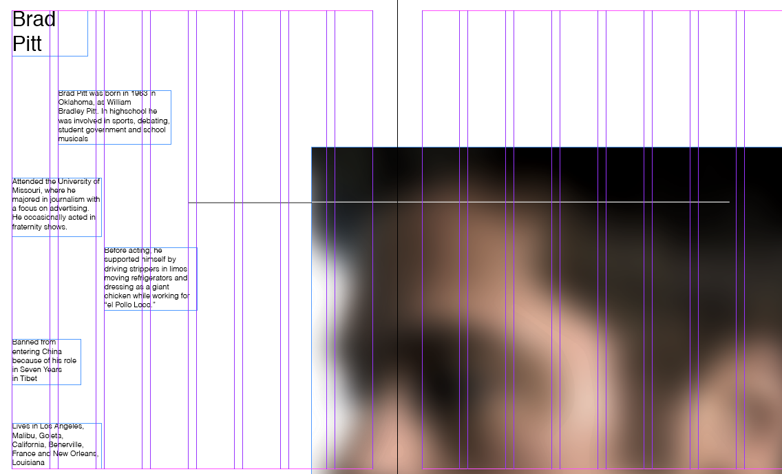
Brad Pitt, was a difficult one, a lot of his trivia, facts stemmed from his looks. I tried to used a tagline that supported this in the best most important way possible. Is it what people think when they think of Brad Pitt anyway? It's not too lame to have as a tagline?
I started researching into 'iconic people', branching out from just three, I came across a large bunch. Previously I have produced designs that included Michael Jackson and Hitler, but Einstein was a new one, this was the chosen fact:
Adolf Hitler: I'm not sure whether to take an obvious approach, using the tagline 'He is responsible for the deaths of over 11 million people" or have one a little stranger, 'as a child his dreams were to become a priest'. Which would the audience connect more to? There is also one that expresses his pain, 'he suffered from urolagnia, insomnia and depression', could this be enticing? Not so much I don't think. I think the 'dreams' one is more interesting, so it might make people aware of wanting to find out more about him as a person, his life?


Michael Jackson - not keen on the image I used, he looks a bit yellow and ill... not that he didn't normally. I don't think I like the colours in this particular image. However, here are two possible quotes that I could use for him:


Sunday, 25 September 2011

Making a start on 'NPG'


This was an idea that I imagined as soon as I read the brief. I want to use faces and type.

Looking at these from further away, I think the image might need to be blurred more? I want the face to be recognisable but not obvious from first look

This one is slightly more blurred, I think it works better, not just like a out of focus photograph, but has more to it?


another idea,