Showing posts with label BRIEF 7 - FLICKS FILM MAGS. Show all posts

Thursday, 1 December 2011

Flicks -varied, related, series

Something that Joe and I discussed in my meeting was how I had established a layout/design that could run throughout the magazines, but hadn't yet taken it further where I could actually design the covers individually as well. Although I had manipulated the images, and changed them, they were the only things that changed throughout (other than the date, selected films). I needed to have more flexibility within the design.

If an image didn't sit well underneath the particular colour type than there needs to be the flexibility to change it.

This is why I want to change the colour of the typeface according to how well it sits with the image, I also want to have the main feature film, placed on the cover other than the spine. Hierarchy!

Here is a more revised cover for January:


I chose blue because it went well with the browns and blacks that existed in the image. I also tried using the same typeface as 'Flicks' for 'The King's Speech'. I overlapped it so create more a merge between the strip on the right and the image. 

Further experimentation, changing colour and different layout/concepts for cover feature:


I have decided to make the main title of each film, relate to the film in some way. I have looked at either their existing film posters to see what type of font was used, I have also thought about the film in general and how it can be communicated through type.
Each magazine issue also has a different colour for 'FLICKS', the colour relates to the film in some way, or sits nicely on top of the specific image that is on the cover.

Here are the 12 covers:


Wednesday, 30 November 2011

Flicks - spread's little details

I have gone back to looking at my design context, looking at existing magazines. Although I want mine to be original, I think it's important to see what existing film magazines are producing already.
I noticed on the Empire's cover there were little strikes/lines along the left hand side of the front page, I tried something similar on my cover

bottom left corner, bit of detail for the back

I thought that I could have these strikes on the spine of the magazine, however it needs to look right when you can only see it on the front cover, 
It looks alright, not sure if it works well with the style of the front. Are the stripes too random?


It seems a bit pointless when it's just a block colour, I may just have it so it's on the spine only 


Flicks - typeface colour

I want to try variations of colour for the title and tagline,


Flicks - cover change,

I have changed the February cover from this:


to this:


I preferred this still to the other one, even though I have changed the film release order slightly, I think the image works better within it's context than the other one.

FLicks - other covers,

Applying my template to other covers, I will manipulate the images similarly to what I have done to 50/50 image.

March

November

April 

Jan

Feb

May

June

July

Aug

Sep

Oct

Dec

I like the overall layout and images with these covers. I changed the layout of '#1 film magazine' throughout developing these, I still need to work on where this would sit. I'm not sure if I need something to join the strip and the image together, even if it is some overlaying text or box? 


Tuesday, 29 November 2011

FLICKS - image layout

I did a little bit of design context and decided to try this way to image layout. I have patterned the image behind the main one. This is a roughly version of it, just to try out the idea, I think it does look quite interesting, however I am going to play around with image layout more. 
I also think the saturation on this image is too high, it's needs to be slightly duller so the type can stand out. 

(desaturated)
(this was a mistake but there is something I like about it, I think it's the weirdness of it. I think if I tone it down somehow it could work)

 I still think it's too harsh? 
Hmm.


Angled and horizontal chops. 

Having the edge white, I quite like how the type oversets slightly. 

Testing out that layout with content I could include on the cover. 


I made the white slightly off-white and also made the text left aligned instead of centered. I also added a barcode. 
Image cropped to show the front cover only
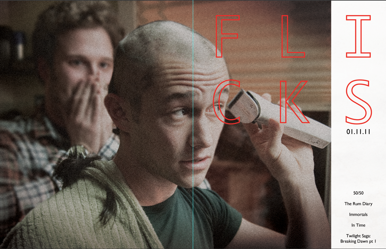
I like how the image and type seems balanced. I also think the type is nice and clear and not too mixed in with the image. 

EACH MAGAZINE
I will have the same layout for each, perhaps with different coloured type
Each will also contain 5 other films being featured in magazine, with the cover image the top title. 


Film mag - 50/50

Here I have used a still from the film 50/50. 
I have altered the image slightly, I think I want to add some texture to it


GRADIENTS
CROPPED
EXPANDED BACKGROUND
ADDED NOISE (DISTORTION & GRAIN)
LOWERED SATURATION
LENS BLUR TO SELECTED BACKGROUND

Film mags - change of name!!

I prefer this to Play House. I think it rolls of the tongue nicely, and seems more like a magazine name. I also think it communicates cinema well, and also seems less intense than Play House. More of a fun, but interesting read. 

NOW I NEED TO SOURCE THE RIGHT IMAGES


Monday, 28 November 2011

Film mag name/logo

I have decided to go with the name 'Play House'. It's relates to cinema, but seems slightly more authentic and original than some of the ones that already exist (FIlm Reel, Uncut, Movie )

Here I am playing around with typeface:


I really like the Gill Sans typeface, I felt it was very clear and also quite contemporary. The name 'play house' could be mistaken for quite an old fashioned/independent film magazine, so I think the typeface modernises it a bit.
Playing around with layout of the typeface, I really like when the type is just outlines. I also think this would be effective when placed over an image.

Experimenting with an image idea, using a vague film strip image. 
Testing out with other fonts, 
Courrier
and
Monaco

Having put the typeface with the film strip image, I think Courier and Monaco actually work better, they seem more landscape than vertical and seem to run more smoothly with the parallel squares. 

In context:


THIS IS JUST A START

1 WEEK LEFT