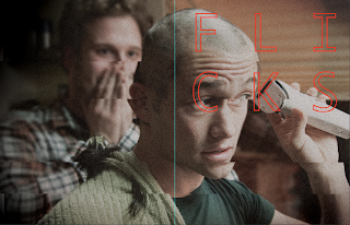
I did a little bit of design context and decided to try this way to image layout. I have patterned the image behind the main one. This is a roughly version of it, just to try out the idea, I think it does look quite interesting, however I am going to play around with image layout more.
I also think the saturation on this image is too high, it's needs to be slightly duller so the type can stand out.
(desaturated)
(this was a mistake but there is something I like about it, I think it's the weirdness of it. I think if I tone it down somehow it could work)
I still think it's too harsh?
Hmm.
Angled and horizontal chops.
Having the edge white, I quite like how the type oversets slightly.
Testing out that layout with content I could include on the cover.
I made the white slightly off-white and also made the text left aligned instead of centered. I also added a barcode.
Image cropped to show the front cover only
I like how the image and type seems balanced. I also think the type is nice and clear and not too mixed in with the image.
EACH MAGAZINE
I will have the same layout for each, perhaps with different coloured type
Each will also contain 5 other films being featured in magazine, with the cover image the top title.


No comments:
Post a Comment