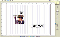
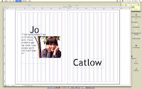
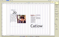
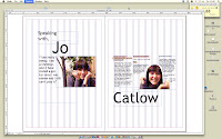
After developing this first double page spread, I realised I didn't actually like it, I thought the colours looked a bit tacky and I definitely prefer black and white photography. I wanted to go for a simple layout, they are the ones I preferred when I was looking through my design context for this brief. The type didn't seem to work, and even though I was going for a centered strip through the middle it just didn't look that interesting.
START AGAIN
I prefer black and white, not sure about this type and also I think the layout is a bit boring.
Experimenting with what could go underneath the large photograph, I like this but I think it seems a bit cliche, I'm also not a fan of this typeface for this particular layout. I also don't like how she is looking down, and the text is also drooping a bit, I don't think that works.
I prefer the type underneath the photo in this, I like the effect when you stretch text to fit the box, although it looks a bit uneven, it makes it a little interesting to read, only a small amount of text though.
ACTUAL ONE
I decided this one to be the finished DPS, the idea I was going for, for the left page was as if it were a strip of film? A role of photos scrolling down the page, with two separated with a quote I thought summed Jo up in only a few sentences. I also wanted a sense of direction with the layout, I have her looking down onto the text, as it descends down the page, each paragraph getting longer each time. I think this DPS would suit a series better rather than a one off article layout, I can see it working with others of the same style but for different people?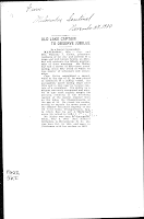 This is an article from a 1920's newspaper, I like the blank space around it, with text that is all contained in a rectangle with a slightly larger, bolder title. This influenced me a little throughout this brief, I like how the structure is balanced out with a lot of blank space to weaken the effect of too much.
 This is an article from a 1920's newspaper, I like the blank space around it, with text that is all contained in a rectangle with a slightly larger, bolder title. This influenced me a little throughout this brief, I like how the structure is balanced out with a lot of blank space to weaken the effect of too much.
IN DESIGN ARTICLE ADAPTATION
TO...
I used this brief as a way to experiment and really get used to InDesign. I'm not really that fond of the layout itself, I think it looks a bit cheap but the process of creating it enabled me to really indulge with InDesign. I used a lot of the magazine features like, text wrap, the DPS layout, columns, bleed, placing images etc... I think it is a bit too blocky, the three images on the top and the text along the bottom all seems a bit boring, however I like how Patrick is dragging the dead body almost through the text, this includes a bit of creativity in the design. I like magazine layouts being quite simple, but only when they work, there has to be a balance. This particular layout definitely looks like a practice one, I can tell that I did it because I wanted to experiment with InDesign. Having saying this, I do like the white space, I like white space as it seems to clean the article up a bit, I experimented with other type for the title but a traditional type seemed to look the most like a article.


No comments:
Post a Comment