1.
2.
3.
4.
5.
My 5 mock ups for different methods of packaging. I have chosen to work with 1, 2 and a fold out poster. I might actually put the fold up poster and the actual product inside the cylinder type package (1), and have number 2, as a stand up flyer to advertise the product?
----------------------------
Designing...
This packaging is perfect for containing other forms of print&packaging.
I had the idea that I could use the packaging to promote the new range of juices? A different way to sell the product.. would it be noticed as that?
I wanted the package design to be clean and crisp to help communicate a healthy, refreshing drink? To enable strawberry to be shown somehow I thought the pattern could be inside the box?
-----------------------------
PINT GLASS&STRAWS&POSTER?
I then decided to change the contents of the 3D package, I figured that people wouldn't clearly see that what I was trying to sell was a bottle of fruit juice. There are ways to promoting/introducing a new range of juices into the market, I thought about the freebies that could be given out alongside the bottle of juice? The box would now contain a pint glass, a promotional poster and a envelope of straws (colour linking to the flavour, red).
chosen nets...
?
design?

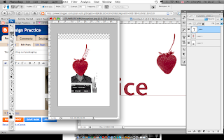
Linking my work with my original 'good thing', mugshots. I thought this was a quick easy design that could easily attract people to the product. It seems so simple, combining a strawberry and a mugshot... works quite well though?
image?
word = juice
Combining the image and type, playing around with layout. I didn't want to type to be too big, as the image is quite striking and in terms of promoting I would rather have the image large than the type. Juice running up the stem seemed the best, it stays close to the image so that the two obviously link, but isn't too overwhelming.


No comments:
Post a Comment