
Final net for the box package, I chose the colours, red relating to strawberry and the cream colour to help represent a clean but also slightly organic feel? Also I had thought that the stock I would use for the other prints would be newsprint, to communicate a bit of authenticity? This way the stock and the colour of this net will link nicely.


Mini envelope for straws. All of the packages remain similar with their design&style.

Chosen typeface, 'News Gothic MT'.

Final poster, onto newsprint. Little bit of informative/persuasive text to make the poster more purposeful regarding the juice package.
Photographs of final:

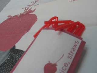


Photographs of final:


No comments:
Post a Comment