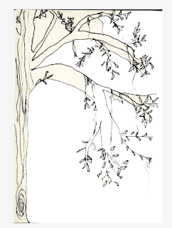
I started off by using this hand drawn tree, I thought about introducing the text around it?
This was my preferred layout of it all, I like how it is all centered but, for some reason I felt it was a bit plain, be too obviously communicated. Just an image with text above and below it?
Tried using photos I had developed, cropped images of them that could represent part of the poem? Almost as if the poem is a bit cropped, and so is the imagery.
I thought about using two images, once representing the tree growing and the other, the roots. I also think it balances it out. However, I'm not sure if the text seems a bit too bold? Also the spacing to keep it all in a box looks a bit rubbish, I want the text to be there but slightly more subtle.


No comments:
Post a Comment