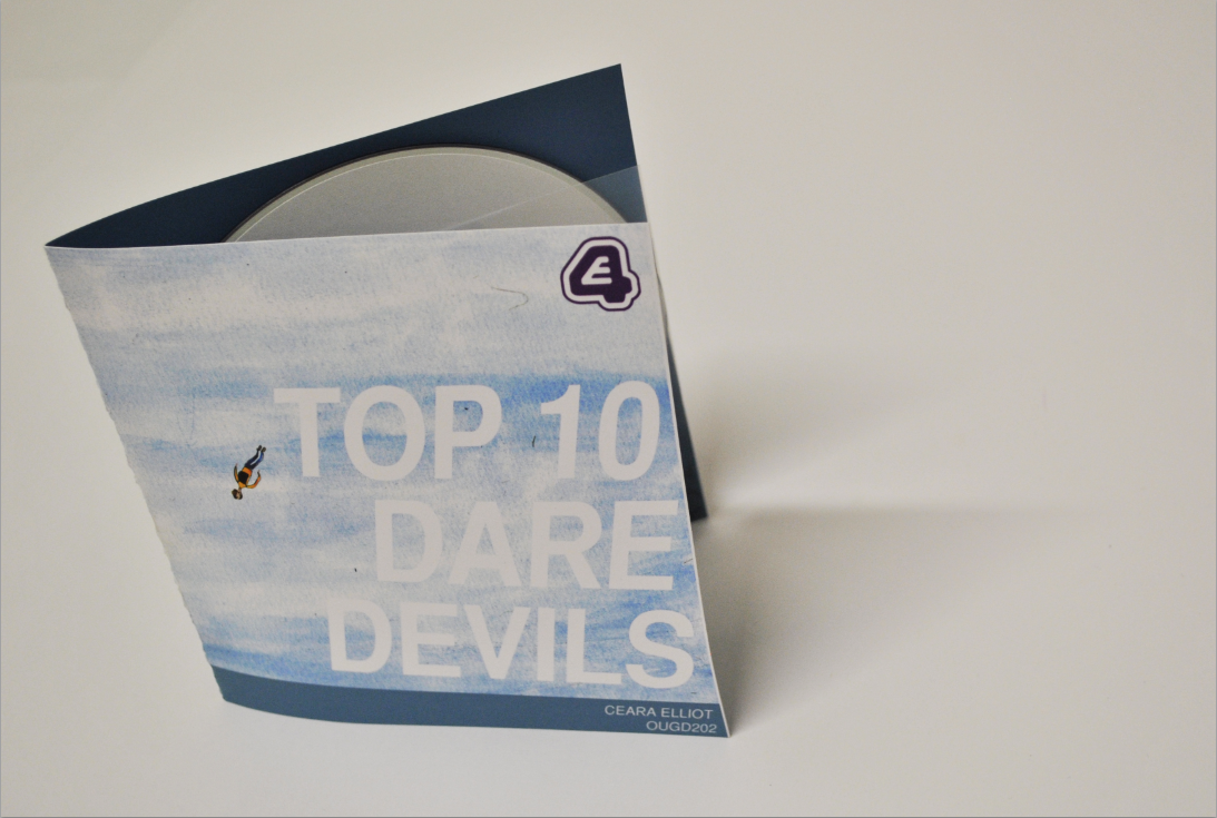
I thought about the flaps to hold the disc in, being a solid colour or maybe thick stripes? The building looked a bit out of place. Using the little man as a figure walking across the piece of thread enables a link to the packaging and the sequence. I want to keep y packaging as crisp as possible, the sequence is quite sketchy with lots of use of watercolours, so I don't intend to do the opposite, but have it much more simple then the sequence.
ACETATE ?
I thought about how realistic my design was, if it was to be mass produced then perhaps hand crafting a piece of thread across the two flaps is a little unrealistic.
I thought about printing onto acetate, this way it acts a sleeve for the disc, but also I can print the man walking across a thin wire onto the acetate, then have it working as an overlay to whatever is printed on the disc (painted sky as on sequence).
Image that could be printed onto acetate, variations (disc and sleeve):
The disc and acetate package could merge together when the disc is slotted in, to create an image.
WILL THIS LOOK GOOD?
This packaging design relates a lot to the dvd's contents, which is what I aim to do, however, I'm not sure if I want to make the packaging more sharp/bold. I don't know if I want to use painted backgrounds for it. Solid colours might seem a bit more appropriate, otherwise, the packaging doesn't communicate daredevils as much as it could. The painted illustrations work as an animation when communicating daredevils because they are accompanied with music and movement. However, when the images are just stills, as a part of the design for a package, they don't communicate it that effectively.
Could I have a solid skyline shape printed onto the acetate sleeve, therefore when the disc is slipped in it, it looks as if the man is walking across the wire that is between a set of buildings.
The type on the disc would be towards the bottom, that way when the disc is inside the sleeve, you can't see it (doesn't get in the way).
After hearing some feedback, the skyline seems more appropriate because it seems more obvious and related to the subject daredevils. The other two images that communicate two buildings aren't as obvious, for people who haven't watched it yet, a skyline seems more blunt as to what the man is doing.
The solid colour doesn't really relate that well to my sequence, but I don't want the image to be really complicated. I am going to paint a simple skyline, but have it very simple, in a dark greyish colour. This image will be the only thing printed onto the accetate.
I like the idea of having a white disc, with a little orange man on it. Keeping it simple but also relating it to my title sequence - the man also stands out, orange on white. Stock colour - maybe a blue/light grey colour? Design for outer cover:
I thought about an orange strip along the bottom, because it could relate to the little orange man? But I do want to keep the colours consistent, I thought the strip could be the same colour roughly as the skyline inside. The skyline will either be a dark bluey/navy or grey colour.
PROBLEM.
If I want the inside of the packaging to be a colour, so the white disc doesn't look that odd, I can't print onto a coloured stock because of the sky I have to print onto? I could - print onto white, but have it double sided, print the colour on the back of it?
Or light grey stock?
So it would look like this? White type onto the coloured stock... wouldn't print... nevermind.
SO.
(made the type for 'DAREDEVILS' bolder, stands out little more, communicates daredevil a little better)
ORANGE STRIP or BLUE STRIP?
If I want to keep the colours consistent between the strip at the bottom and the skyline printed onto acetate, then maybe an orange skyline will be too bright, and take the focus away from the man.
BLUEY GREY.