Showing posts with label DESIGN DEVELOPMENT. Show all posts

Wednesday, 17 November 2010

juice bottle production and photographing

I had always thought about how I was going to make the juice the extreme colours I wanted. I had thought about food colouring, or photoshopping the colour, with added hue and contrast?
Turns out watercolours were perfect:


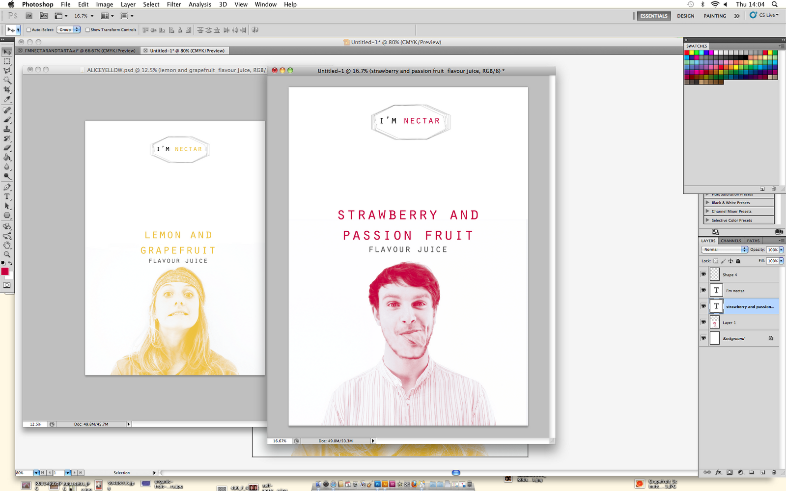
I tried to match up the colours perfectly to the colour that runs througout the label. 
Even though the juice looks a little bright then your average juice, the type of responses I received were, 
"Would be sweet if juice was really that colour"
"You're making me really want some juice"
"They look tasty"

Even though the bright colours look a little like paint, I think with the labels and the fact that the orange juice is actually completely natural, it kinda evens everything out into being, a brightly coloured juice.


Final shots. 
These are screen shots of the photographs I took that I then edited slightly to use for my boards.
front view

side view, you can see the back of the bottle slightly

side view 2 

Back of bottle


I am pleased with how my bottles of juice have turned out. 
I was worrying about a few things, like how the labels would look as a set, the colour of the juice and also whether the labels would fit perfectly. 
I think the labels balance out well, a large image on the front, is balanced with delicate, simple type behind.

I'm just hoping the juice doesn't look too much like paint.

Tuesday, 16 November 2010

SUDDEN LABEL DESIGN CHANGE.


These were how the labels were going to look originally. The layout of the label was inspired by the layout of the drink 'This water'. 
When I was placing the image of the mugshot into the label, it came up a lot larger before I readjusted the size. Alice Vine and Ben Mckean said they much preferred the design when the face was larger. I agreed, so I decided to do this to all of the designs. 

I did quite like how the two colours did go together quite well here, but I wanted to keep my designs consistent throughout. After trying the design out with all colours matching to the same pantone, I did actually prefer it that way.


Here I the labels all complete, on an A3 sheet, ready to print. 

Wednesday, 10 November 2010

posters


Larger image on the poster?


Border?

I like how these have turned out, I think I will print them around A2 size, on gloss/silk or matt paper. I wanted to have the logo spot varnished, however in print you can only print onto silk/glossy paper for it to work properly and it isn't proper spot varnish. This doesn't matter, as effectively they are kind of mock ups. 


Thursday, 4 November 2010

first designs with photographs (posters then onto packaging&print)


changes, 
  • logo
  • typeface for logo?
  • spacing between type?
  • level all heads/type
  • LOGO MUST CHANGE


changes, I have changed the spacing between the type, the logo is also different, and I am beginning to line up all the images and type so as a set together, they'll collaborate well.


design with photographs

lemon and grapefruit
I took mugshot style photographs of some friends, then made them black and white in Photoshop.

Finding the right 'duotone' Pantone combination. I found having one colour and a pale pink made the colour easier to define, when I mixed two, like yellow and pink, it made a darker, more unclear colour that didn't relate much to the fruit.
strawberry and passionfruit


The photographs have turned out well, I need to test out this design on a bottle and the other types of context. I'm also not sure about the logo, I'm not sure if it looks tasty? The poster doesn't communicate fruity I don't think... 
More experimentation... 


logo design

words;
taste
squeeze
juicy
tropical
tropi
mix
blend
sweet
gulp
drip
shake
drink it
fruit
juicer
bottle of
good
flavour
mixes
jumble
nectar 


NECTAR
I'M NECTAR


These are just some rough ideas for logos, I don't like any of them.
I'm going to draw some, maybe include fruit in the logo to make the message more clear and .. tasty. 
However I want it to be quite minimalist I think, because it is going to be alongside a photograph, I think everything else should be simple and clear.


Tuesday, 2 November 2010

animal faces? just an idea


This was just another idea that sprung to my mind. Through the process of branching out into other ideas (like having the fruit in the persons mouth/using cartoons), I also thought about using animal faces. The fruit could be in animal's mouths? The idea was just due to attracting my audience through strangeness. If I saw an owl with a cut in half lemon and grapefruit, I would pick it up and want to try it. 
Analyzing the designs:
At first I didnt like the owl's eyes being covered up with fruit because I thought the eyes were actually quite an essential feature of the drawing. However, I feel after adding the black pupil to the center of the fruit to make them look more like eyes, it kind of works. 
I do like the final design, but it is just an idea at the moment.

working with cartoon, idea


with colour on the man?


I followed the idea through where the fruit is included in the design. Whether it in the person's mouth? or whether they are holding them? In this case, a little simple cartoon is juggling them, the only problem is that his face isn't a main feature as much. 
I understand that my designs are changing a lot, I think I need to go through this process though in order to pick out the best features of each. 

Or carrying them?


Another way to use the carrying man, the fruit is stacked up. It could represent the weight of the fruit, as being substantial and heavy that the man has to carry it all over his head. This could communicate the quantity of fruit in the drink?

I like the white of the design, it kind of makes the drink appear clean and healthy. Obviously these are mock ups, so the quality of the tracing/cutting around the edges is quite poor. I think the design is a little too simple, and the real fruit doesn't work so well with the cartoon?

Once I have the photographs taken, I will be able to compare the different designs.