Showing posts with label YCN. Show all posts

Wednesday, 25 May 2011

Wednesday, 23 March 2011

Tuesday, 22 March 2011

YCN - final presentation, questions raised, and action plan


I  found this final presentation very useful. Most of the questions raised were appropriate and did make sense, once they had been considered, I feel that our boards would be a lot more logical. Spelling was something that I am glad was looked at, it seems to be something that I found hard to spot myself, if I had missed out a letter or something, correcting it definitely would make a difference. The presentation was also beneficial because it was a fresh pair of eyes trying to understand the boards, if it didn't communicate to them then it would'nt to the YCN markers. 


I didn't think any of the issues raised were unfair, however some points were opinion based, and didn't run consistently with other opinions. I find it is hard to please everyone, so it's best to go with the majority and also which ever you prefer as well. 

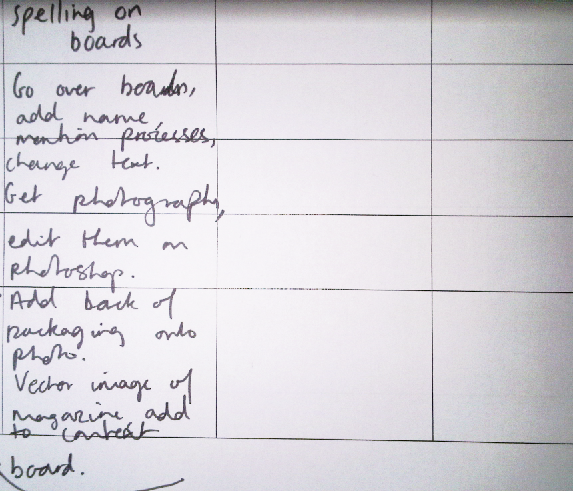
Action plan,

Monday, 21 March 2011

YCN - developing and designing the back of the packaging,

Me and Sean had discussed that if there was going to be a flap that secured the packaging together, it would sit around a quarter of the way down on the page. This gave me a rough idea of how much space I had. 


I shortened the descriptions because otherwise there would be too much text. I kept the crucial words that described each flavour, as Green and Blacks would've done. 


I felt that the ingredients were too long, there was too much text, and I had to get the font size down to 4pt, which would make it very hard to read. Was all of the ingredients needed? Or any at all? For each individual flavour. 


I decided that the ingredients weren't completely necessary, the layout sat better and also made all the text actually legible. 

However, including allergy information seemed important.

How it would appear on a brown, text an off white colour.

YCN - point of sale, design in context


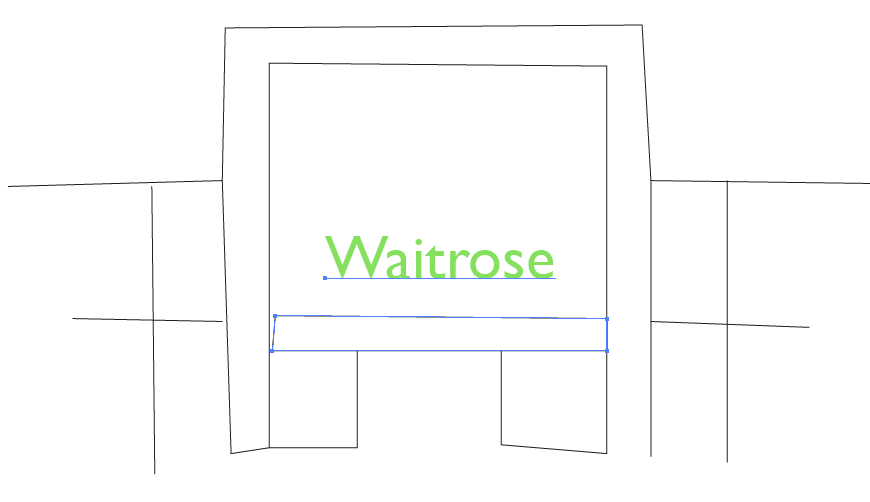
Vector images, 
I used an existing image, made the opacity lower, and then traced over.

context
context

context

point of sale

These are the vector images with the promotional material applied. 


Sunday, 20 March 2011

YCN - developing 'An orchestra of flavours'


Chocolate peanuts...
I really wasn't happy with how these turned out, they just looked cheap and didn't really seem very Green and Blacks. On a positive note, they were small enough to arrange to a higher standard, they represent a birds eye view of an orchestra quite well. However, they just looked a bit rubbish, not a premium chocolate.


I then tried Lindt mini eggs, once the foiled was pealed off them, they did have a smoothness to them and I actually preferred the consistency of shape. However, looking  back, this doesn't really relate much to an orchestra layout. I also thought that the chocolate lacked a sense of intensity, perhaps something shinier would look better, the richness of Green and Blacks could then be communicated better.


Minstrels
Minstrels seemed a good choice, they were shiny, all the same shape (which now I thought looked better than a variety of shapes). I also thought, they worked well when producing the curved shape of the orchestra, it seemed very neat and more sophisticated, and because they were a darker shade of brown, seemed more chocolatey. I thought I had the final photograph to use, but realised that I needed to take it portrait so I could add text etc..

This was the final image I could use, with shading along the top and bottom adding a bit of organic, texture to the background, and also a brown photo filter applied in Photoshop, to make the overall image more intense.


I increased the width of 'an orchestra of flavours' so it fitted more alongside 'Pebbles'


Increased contrast, much more rich.I thought that the flavours being positioned on top of each other, sort of suggested that the product focused not on the variety, but that each bag of Pebbles would have one flavour inside. I changed the layout of the flavours, so they sat next to each other, like a sentence. Does this seem more like they are a collection of flavours in one product?