Sunday 22 November 2009

Visual Language - Colour session 3

We were working with coloured paper in order to create contrasting and complimenting colour combinations:


When yellow is on blue it appears to stand out more then when blue is on yellow. It also looks more of a brighter yellow when placed on a darker background. When the blue sits on the yellow, it darkens the yellow. I think yellow on blue works better


Similarly the lighter colour on the darker colour seems to stand out more then the other way round. These are complimentary colours, they are on opposite sides of the colour wheel so naturally either way, they do work quite well together. The green looks greener when on red, and the red looks a lot redder when infront of a green background.


This combination seems to communicate 'warning'. The typical colours, that when together often communicate some sort of hazard, e.g road signs etc... I think the black on yellow looks better, because black is so dark, the yellow is washed out quite a lot when it is on the black background.


When I included white we can see how much it blends with the yellow compared with the black. This is probably why black and yellow are used for warning/hazard signs because the black really stands out.


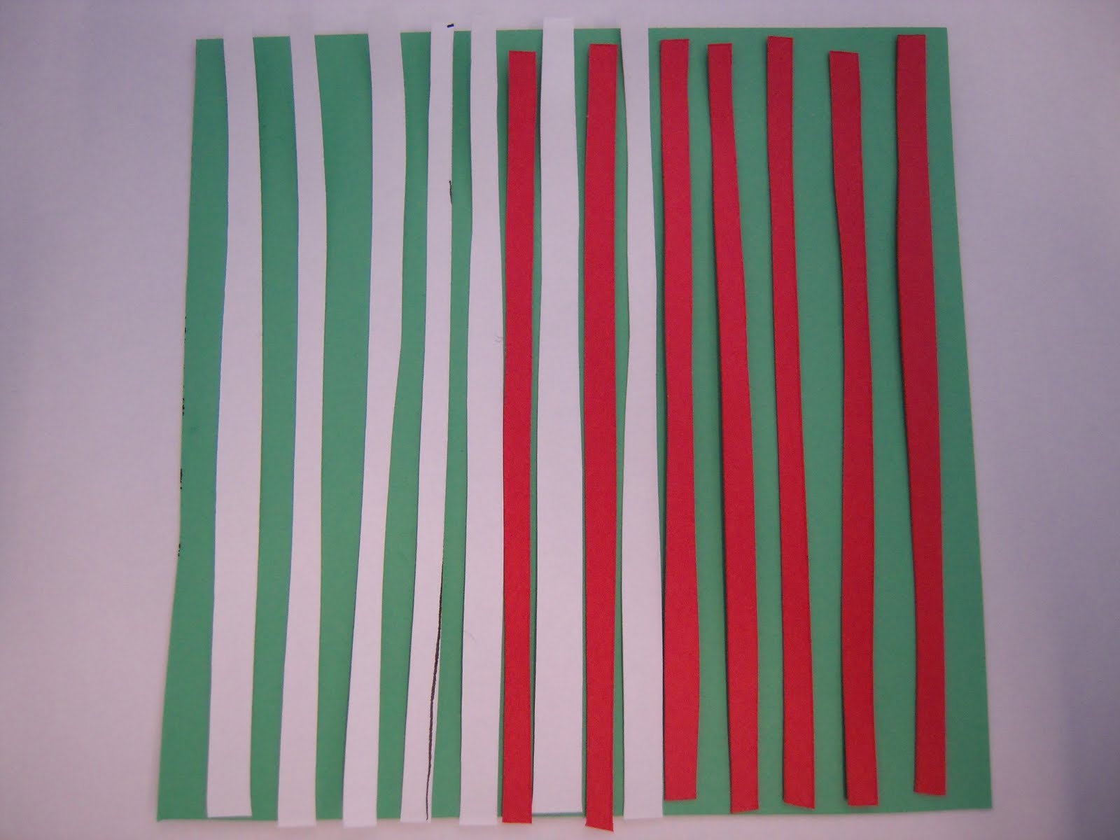
It is the same with these colour combinations too, the white and green blend really nicely, sort of communicating clinical, fresh and minty. The green looks greener when alongside the red, more so then when it next to the white strips. White tends to wash out most lighter colours, and some dark, however it stands out a lot when faced with darker colours.


With black and white, we can see how bold they both are, and they both work very well together whatever way round. Personally I don't think one looks darker or lighter with whatever is on which one.


When white is against a coloured background (orange), depending on it's hue and lightness, I don't think it looks as bright. This could be because white is a neutral, orange's complimentary colour (blue) is trying to come out through the white. The white doesn't look as washed out as if it were on a lighter background, like the bright yellow.


These are two colours, that when together I think look quite garish. The orange looks much brighter when it is on the green background, even though both sets of orange are exactly the same, it looks a lot duller when it is behind the green.


When the red strips were placed on an orange background, they didn't look as red as when they were over a brighter yellow. The contrast is greater with yellow and red, as apose to red and orange. Their positionings on the colour wheel are closer linked.


Looking at yellow and black, I added one of the colours as a shape communicating something. In this case, this could mean turn/look right, with the use of a simple arrow shape in black. It works well on the yellow because the darkness of the black not only makes the yellow bright, but also doesn't wash out the yellowness of the colour. It works much better then having two colours that don't work as well:


These colours do nowhere near as much as the yellow and black. The look is much softer, the particular green actually seems to make the image look quite calm. If the colours were higher in hue and contrast, the overall image would look horrible and the orange wouldn't really stand out.

Friday 20 November 2009

Message and Interpretation

Due to the feedback I got from my three posters, that basically stated how my posters were quite hard to understand and didn't communicate the point I was wanting to make, I decided to take a completely different approach.

We had two weeks to produce a ten editions of a chosen mail shot, that was linked to our posters, in terms of the topic and their style (however not the style in my case). The mail shots were to be a specific envelope size and that were able to fit through a letter box, and naturally arrive safe and in one piece at the chosen address.

I was stuck as to how to communicate my topic, being, not to stereotype young people. I spend a lot of time thinking of how I could do this. I had decided that my mail shot would contain a poster or some way of persuading the audience, with my design containing image and text inside. I realised I had to use a phrase that explored my topic, I came up with "He must've been pissed when he graduated with an MD in Medicine". The approach I took when thinking about this, was based around sarcasm, I didn't just want to write out, don't stereotype, I wanted it to be sarcastic/clever. I drifted away from the colours I had used for my posters, I felt the green and white looked more clinical than educational?


I had seen the navy and orange on a few university websites and thought they went well together, I had also learnt in my visual language lecture on colour that orange and blue were complimentary colours. This could maybe communicate positivity, which is what I was trying to say. This was the design I came up with for the poster that opened out in the envelope:


I printed them out onto matt paper, double sided to that when you opened the envelope the small poster inside was on the same paper, it just folded out. I wanted them to be simplistic and straight to the point, not to complicate the subject further.
I then had my final briefing with a tutor and a selection my students where I had to present my posters first and then my mail shots. The feedback I got from that was good and bad. The preferred pieces of graphic design were actually the posters I had done before, and it was suggested that I keep on with their style/design and develop them further into the mail shots, not my new design. I did feel a bit drained as I spent two weeks thinking and creating a new design but at the same time, relieved that my posters weren't as bad as I thought they were after getting my first set of feedback. This is the new mail shot I created after the final crit:


Sunday 15 November 2009

Visual Language - colour session 2

Following on from our previous colour session, we were all asked to create a colour wheel with the objects we had brought in.

This was our version, but made up with the different coloured objects:


After we had arranged our colours in a structured way, we were given a lecture on how colour reacts with other colours. The context in which a colour sits, makes a big difference as to how it appears to us, and how it communicates something. We were asked to take 10 objects of our own colour (blue) and then 10 from its complimentry colour (orange), and then experiment with them and their varying contexts. I chose specific photos of this to analyse:


This is an obvious colour blend/contrast, when the light blue sits on the black bacground, it looks a lot bluer than the darker blue. The dark blue tends to blend more into its dark background. However, the lighter blue background actually helps the dark blue look more blue this time. Not only is the light blue almost perfectly camoflaged, but because it relates too much with it's background, it doesn't stand out as much as it's own colour-blue.

Because this object was a clear orange, the best comparison I can make is the fact that when the orange is on top of white, it looks more orange then when it is on the red background. Red and orange are too close together on the colour wheel for them to work well individually. Whereas, white is a neutral colour, so our eyes can focus mainly on the bright orange, and also it's own complimentry colour (blue) that can seep through slightly onto the paper.

Although, the blue is the same in both photographs, because it is on different backgrounds, it looks slightly different. I placed tracing paper on black card to soften the darkness of it, the blue tape when on this greyish colour seems to blend in more and not look as blue as when on a dark background.

Similarly, this happens again with these objects and their colours. The blue seems to look more blue on a darker background because it contrasts more.

In this photo, all the cutlery are the same colour, however when the orange fork is placed on a pink background it looks a different color to the others. It looks more red, according to the objects background, our eyes percieve the colour of the object differently.

With these mixtures, I can see that the light orange star looks brighter and more orange on the black background then it does on the green. This is because orange/yellow and green are not complimentry so together they don't always show off to their full potential. On the black background, the bright orange can really be expressed, it stands out, and the neutral black enables the human eye to gradually develop it's complimentry colour slightly in the background.

Simply this one is blue on blue and orange on orange, then switched. The colours when on opposite colours, stand out more, look more orange/blue because they don't blend as if they would do if they were the same colour.

The blue seems to look more dull when it is placed on a yellow background. I think it's because the blue is quite a yellowy blue, so they blend nicely but in terms of contrasting the bright red helps the bright blue look bolder.

The orange star is the same colour in both photos, however it appears to look brighter in the top photo, the combination of the very bright post-it note, when put next to the bottom photo seems to generally make the image look lighter. Although, in the bottom photo, the star looks more orange, maybe slightly darker, but definitely brighter. I think this is because of the pink background, makes the orange look more orange.

Monday 9 November 2009

No News Is Good News - Poster

I had a week to produce this brief, which was to design and present 3 posters that communicated a chosen statement/fact from our previous article we had studied. One poster was to be purely image, the other purely type and the third a combination of image and type. All were to be printed on an appropriate stock that also counted as one of the 3 colours we were allowed to use.

We were advised to come up with an idea quite quickly and just work on that, seeing as we didn't have that much time to do it. I thought about how I could render a common, alcoholic image into trying to communicate how not all teenagers equal a bottle of vodka. I had previously seen an 'absolut vodka' that had been altered, I decided to work with that.
ABSOLUT ARMY? - contrasting, but does it communicate the fact that teenagers shouldn't be stereotyped?
ABSOLUT PATRIOTISM - I thought this worked better, as it works as a phrase, but the spelling of 'absolute', alters the image's look as a whole.


These were the 3 posters I produced, using a bottle of 'absolut vodka' as my main image focus, and the correct type that also relates to the brand. To clarify my point of the poster, I included the two facts that basically imply that not all teenagers are charged with bottles of vodka.

Visual Language - Colour 1

We were asked to bring in 10 objects of a certain colour, I was given blue. We were then grouped together according to the colour we had, this meant our group then had 50 blue objects to work with. Organising the objects relating back to their shade of blue, we decided to order them dark blue to light:


darkest-------------------------------------lightest

We then looked at the colour library known worldwide, Pantone. It is used to distinguish the varieties of colours and how they would appear on different surfaces. It is basically used to help designers choose the right colour for a certain design and to check out they would print on different surfaces.
To develop our knowledge of pantone, we were asked to match 10 of our object's colour, to the correct colour looking at the large range of colours found in the Pantone booklets:


We then laid our objects out, with the correct Pantone number underneath them: