Wednesday 30 November 2011

Flicks - spread's little details

I have gone back to looking at my design context, looking at existing magazines. Although I want mine to be original, I think it's important to see what existing film magazines are producing already.
I noticed on the Empire's cover there were little strikes/lines along the left hand side of the front page, I tried something similar on my cover

bottom left corner, bit of detail for the back

I thought that I could have these strikes on the spine of the magazine, however it needs to look right when you can only see it on the front cover, 
It looks alright, not sure if it works well with the style of the front. Are the stripes too random?


It seems a bit pointless when it's just a block colour, I may just have it so it's on the spine only 


Flicks - typeface colour

I want to try variations of colour for the title and tagline,


Flicks - cover change,

I have changed the February cover from this:


to this:


I preferred this still to the other one, even though I have changed the film release order slightly, I think the image works better within it's context than the other one.

FLicks - other covers,

Applying my template to other covers, I will manipulate the images similarly to what I have done to 50/50 image.

March

November

April 

Jan

Feb

May

June

July

Aug

Sep

Oct

Dec

I like the overall layout and images with these covers. I changed the layout of '#1 film magazine' throughout developing these, I still need to work on where this would sit. I'm not sure if I need something to join the strip and the image together, even if it is some overlaying text or box? 


Tuesday 29 November 2011

Elliott m - RANGE

I was thinking in my head how I could broaden the elliott m range, perhaps tickets/t shirts, just things I can mock up?

DO THEM/

Should I be making the brief bigger? I feel I need a range but initially this was going to be a quick brief to design album covers

GIG POSTERS?


NOT SURE. Is this useful/appropriate time management?? //////////////

FLICKS - image layout

I did a little bit of design context and decided to try this way to image layout. I have patterned the image behind the main one. This is a roughly version of it, just to try out the idea, I think it does look quite interesting, however I am going to play around with image layout more. 
I also think the saturation on this image is too high, it's needs to be slightly duller so the type can stand out. 

(desaturated)
(this was a mistake but there is something I like about it, I think it's the weirdness of it. I think if I tone it down somehow it could work)

 I still think it's too harsh? 
Hmm.


Angled and horizontal chops. 

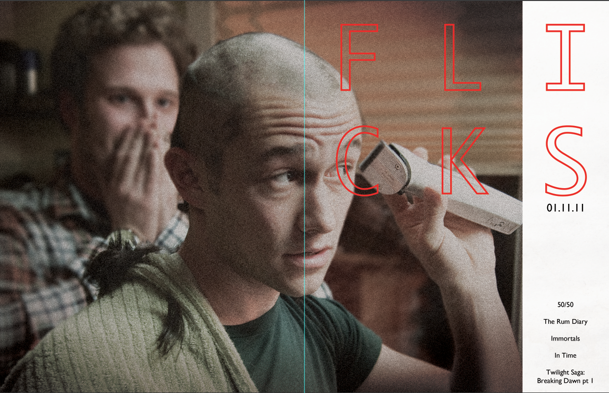
Having the edge white, I quite like how the type oversets slightly. 

Testing out that layout with content I could include on the cover. 


I made the white slightly off-white and also made the text left aligned instead of centered. I also added a barcode. 
Image cropped to show the front cover only
I like how the image and type seems balanced. I also think the type is nice and clear and not too mixed in with the image. 

EACH MAGAZINE
I will have the same layout for each, perhaps with different coloured type
Each will also contain 5 other films being featured in magazine, with the cover image the top title. 


Film mag - 50/50

Here I have used a still from the film 50/50. 
I have altered the image slightly, I think I want to add some texture to it


GRADIENTS
CROPPED
EXPANDED BACKGROUND
ADDED NOISE (DISTORTION & GRAIN)
LOWERED SATURATION
LENS BLUR TO SELECTED BACKGROUND

Film mags - change of name!!

I prefer this to Play House. I think it rolls of the tongue nicely, and seems more like a magazine name. I also think it communicates cinema well, and also seems less intense than Play House. More of a fun, but interesting read. 

NOW I NEED TO SOURCE THE RIGHT IMAGES


heinz - another freeby

Everyone loves free stuff,

I have decided to attach a free green pen with every bottle of Heinz Salad Cream, and also have a little card attached to the neck of the bottle that has a mini word puzzle for the customer to solve.

This is the idea I had in mind. I will design the little card that will attach around the neck of the bottle. 
I also think the green pencil will be attached to the bottle through the label that wraps around it. 


salad cream, poster colour variations,


I think these are lacking texture, I want them to have an organic feel to them. I think because I have only used type they could lack a sense of 'taste'. I need to communicate organic, authentic, warmth. 


I prefer these now with more texture and faded colour. It gives the image a worn, used look, but also healthy, like it has a little more life than just a flat image. 


Testing out other colours. I think they look too much. The colour scheme common with heinz salad cream, is a creamy, off white colour with the classic green. I want to stick with these colours, I also think it focuses more on the concept behind the poster. 


I will apply this colour/texture to the mail outs.