Wednesday 26 May 2010

OUGD103, evaluation

I have liked how this module has taken steps from project to project, I have been able to experiment with a variation of production and process methods. From 'communication is a virus', I learnt that I definitely really like aspects of using video to communicate messages. I was able to develop my skills in Final Cut and work as a partnership with Sean Perkins, which was a lot of fun! I also like the work towards filming, story boards, inspiration, a lot of it can be done through imagination, which is how I like to work. I like to visualise work before I produce it.
Vogue was a nice little brief. It was something I had almost total freedom with, I liked being able to just produce a poster after given one word. It was such a simple, short brief yet also enjoyable just to have a little fun with producing a poster to be entered in a competition, with fingers crossed. I followed my gut when it came to this brief, I felt we had too little time to drift about, when I thought of Vogue, I thought of French. French colours, french text, handwritten almost like a sketch book along with a diary entry. The text is a short poem I wrote, about the pressure 'vogue' creates. I enjoyed this brief and would definitely like to do it again.
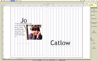
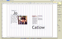
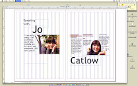
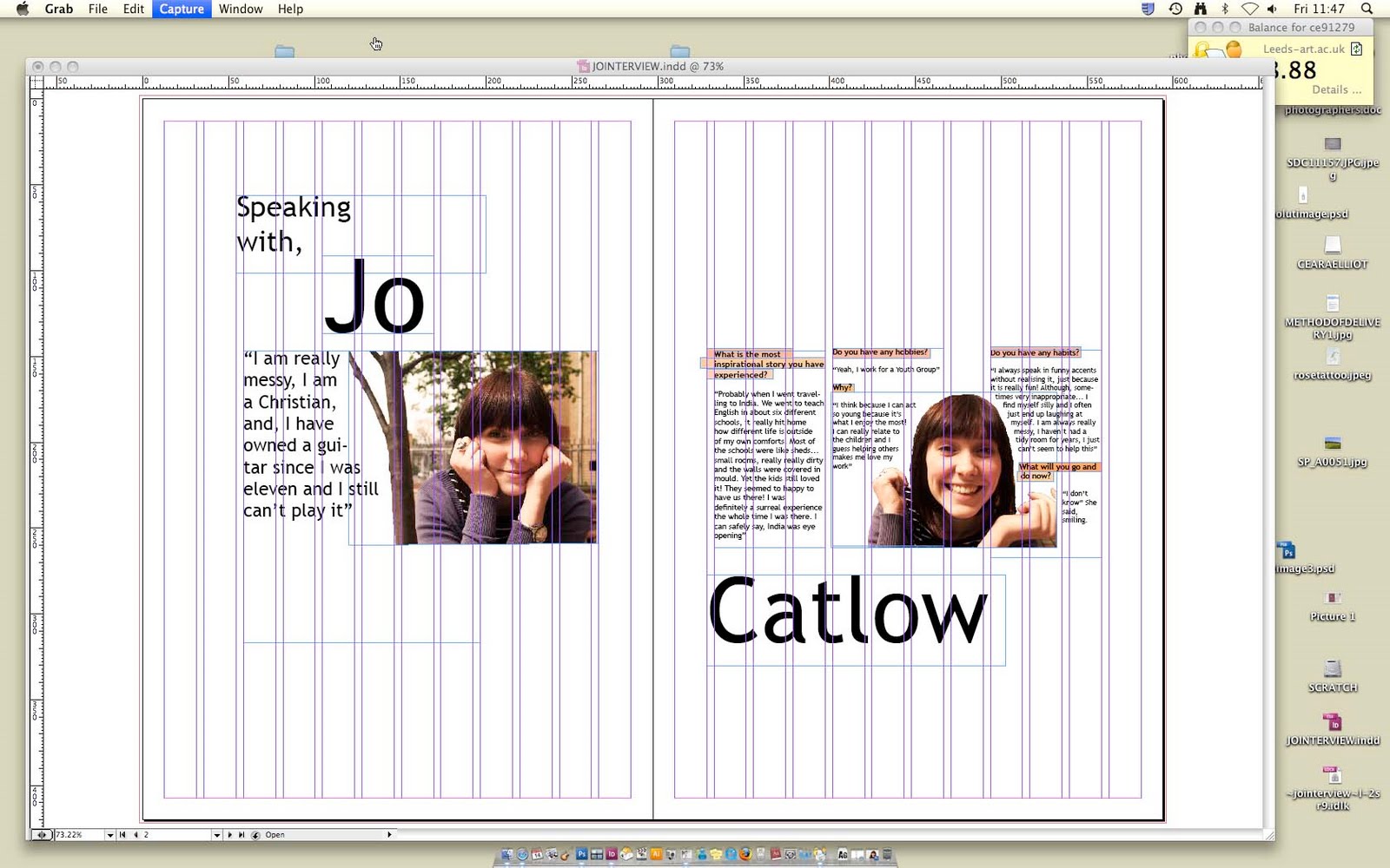
I also thought InDesign was a fresh project, the whole software was new to me and I enjoyed finding out about it, I feel it will be very useful for future projects. I liked how what we were being taught were double page spreads that you see every day in magazines and newspapers, and I feel after new knowledge about layouts etc.. I understand it all much more. I also liked this project because I like layout in design, I think it's important. Working towards an article was interesting as well, writing about someone and relating a piece of work to them seems automatically purposeful and exciting.
Speaking from experience was a project that I found fun to work with. The title itself already makes it something I can relate to myself, therefore audience and research is something I can really indulge with. I chose to promote my piece through posters and things quite visual, I feel that when I was a first year I was given so many things, that sometimes just a simple piece of visual graphic design can make a difference. The highlight of this project was actually the production method. Due to me being a bit unorganised in the fact that the digital print room was overflowing, my print slot was too late for my work to be ready for final presentation. I decided to screen print. Luckily, I really enjoyed doing it, and have basically learnt how to do it, I reckon I could go down to Vernon street and be alright with sorting it all out and stuff, cleaning screens etc... It also looks so much better then digital print, when dealing with block colours.
All in all a productive module I think, learnt, developed, enjoyed new processes and techniques. I feel I could've pushed myself a bit further though, maybe take things to the next step, challenge myself!


Start now.

Monday 24 May 2010

speaking from experience, product in context


I thought about other products my project could develop into, t shirts are nice ways of communicating I think. They have the ability to advertise and promote a message all throughout the day, it would be easy for my audience to see this as they could either wear it themselves, or be with someone who is wearing it. The shorts are quite a similar colour to the pink I used for the background, so for this purpose I changed the font colour to pink and had the background (t shirt) just plain white. Although I think I prefer it this colour on t shirts as the pink would be too much? There could be a range of these, all the different 'want' and 'need' could work nicely and also, become part of a continuous message.

speaking from experience, self evaluation

I identified the problem through speaking from my own experience that, when you have freedom, independence and money you tend to make the wrong decisions. I aimed to help first years prioritise what they ate/bought etc... When I asked the current first years what they wanted, I received answers like "a really nice lunch everyday", and "a chocolate bar". When put alongside what they should actually get, in terms of what they 'need', the answers were "a homemade ham sandwich" and "special pens for my type and grid". I was aiming on constructing a piece of design that communicated the relation, and difference between what people want, but what they should actually get because it is what they need. My research fitted all into primary, with aspects of it including both quantitative and qualitative. I communicated directly to first years, I wanted to get feedback that actually happened to students this year, seeing as the brief was 'Speaking from experience'. I think my questionaire was useful, my overall project was dealing with quite a simple, straight forward idea which developed from a very simple design context. This method of research was easy to understand, relate to and also was fresh and realistic as it came from real situations. In terms of research development that could've helped me, I think I could have done more design context research in order to experiment with poster designs etc... Although I did find pieces I liked,
and they did influence me, there is never a limit on how much DC you can do. Throughout this project, basing my answers on design process, I have learnt:
  1. Getting feedback from existing first years and yourself is more trustworthy and relevant, especially when dealing with a project that is trying to communicate to people who are currently in your own position
  2. Never be completely satisfied with your work early on. I realised that trial and error is a good way to progress your work onto something better. I thought I was happy with the type and layout of my first design, but I changed it and tried something different and I actually preferred it a lot more.
  3. Colour makes a huge difference, I have decided the colour pallet I used for this brief I actually really like.
  4. SCREEN PRINTING IS LOVELY. I originally planned on digital printing my posters and all my work, for efficiency and just because I didn't think of any other way. Everything happens for a reason, my print slot was quite late and I wanted to have final visuals for Friday. I had a few days in which I decided to screen print, although the process itself is so long, the outcome is so much better. I also think the style of my poster (block colours, simple drawings, bold font), works well with screen printing. I will use screen printing again.
  5. Sometimes simple is better, I went from choosing little phrases that would go on the designs, with detailed drawings, edited on photoshop etc... to just two type and two images set out in a simple way. This looked a lot more effective and assertive.


Next time, if I were to do things differently, I would:
  1. Further research into my project, varied typefaces and design context.
  2. Perhaps experiment more with overall content, what other ways could communicate this problem
  3. Did I find a solution too early on?
  4. Decide to screen print earlier so I could produce more of a variation of my posters, also, not produce 10 copies on the best paper
  5. Maybe find a more complex way to solve this problem? Was it too simple?

Wednesday 19 May 2010

speaking from experience, screen printing


Splitting the design up into the layers I want to print separately. I completely forgot about this when I was designing it so all the layers were different so I had to make 5 new documents which I then realigned each image to. Printed onto 3 A2 sheets, with pure block black, perfect to expose.


Background colour, important that I get it right. I didn't want it to look too girly, so the pink had to be as salmon as possible (little dull) but not too dirty. I also wanted it as pale as possible, but not too much so that it just looked washed out. Took a while to mix the perfect colour, but the pastell pinky/salmony was accurate enough.

One of the exposed screens, with all the sandwich layers on it


The first two layers, the background and the packaging of each sandwich

I then added the ham (filling) which was a slightly darker pink then before, I still wanted it to look hammy, but there a difference between the two.


I decided I wanted to include the lettuce in the top sandwich because it expressed the 'want' of a shop bought sandwich. I really like lettuce in my sandwiches, and guaranteed all of the home made sandwiches I have ever made, none have ever contained lettuce, it is one of the luxuries of buying one. This is why I thought it important to include the lettuce in this particular sandwich. However, because I hadn't made a screen for it, I had to use 'red filler' that coated the part of the exposed screen I didnt want any ink coming through. I chose to the the bread screen as it had more space I could work with. I went for a pastell green again, nothing too bright, subtle detail.

Poster without black outlines

Adding the black outline, I chose to mix charcoal grey with black as I didn't want the black too harsh.


Final poster. 10 copies, 6 colours, 3 screens.
I printed 10 of these, I'm not quite sure why, I was thinking perhaps selling them? Or as part of their purpose this brief, they would be reproduced as a batch. Due to time and funding I couldn't do any more of the varieties, I actually printed onto a very expensive stock because any normal cartridge paper would crinkle under the wet, heavy coated background. I am pleased with them though, and I definitely prefer screen printing over digital print when it comes to printing block colour. Although the process is long, it is definitely worth it.


Sunday 16 May 2010

speaking from experience, posters-new printing method


Everything happens for a reason, I didn't get a very early print slot, and I really want to have final visuals pretty soon. I was thinking that a lot of my design context has been screen printing, I think the style of my posters would actually compliment this particular printing method. I will either narrow down my prints to three colours only (which can be done with the banana one and the sandwich one), but not sure about milk one. This will be a very long process, if I am doing three or four screens for one print. I will definitely print the sandwich one but need to consider the other two, I think the maroon background of the banana one would look really good screen printed. Pretty excited to print them actually, the quality of the posters will be a lot higher now that I am going through this process. Far more exciting than just digital printing. I will still be digital printing the key rings and fridge magnets because they would be too small to screen print and also I would need another load of screens.

MINI CRIT FEEDBACK
I had a small crit with some other students and John, I was a little unsure whether I should produce the flyers because I thought they might just be a bit pointless in the sense that if there are posters available then they communicate exactly the same thing. I didn't really have anything to put on the back of the flyers to make them purposeful. John suggested I leave the flyers as he agreed with what I was saying. The screen printing idea also went down well, as block colour apparently looks really nice screen printed. Now I just need to get down to Vernon Street.

Friday 14 May 2010

Jo, InDesign


After developing this first double page spread, I realised I didn't actually like it, I thought the colours looked a bit tacky and I definitely prefer black and white photography. I wanted to go for a simple layout, they are the ones I preferred when I was looking through my design context for this brief. The type didn't seem to work, and even though I was going for a centered strip through the middle it just didn't look that interesting.
START AGAIN

I prefer black and white, not sure about this type and also I think the layout is a bit boring.

Experimenting with what could go underneath the large photograph, I like this but I think it seems a bit cliche, I'm also not a fan of this typeface for this particular layout. I also don't like how she is looking down, and the text is also drooping a bit, I don't think that works.

I prefer the type underneath the photo in this, I like the effect when you stretch text to fit the box, although it looks a bit uneven, it makes it a little interesting to read, only a small amount of text though.


ACTUAL ONE


I decided this one to be the finished DPS, the idea I was going for, for the left page was as if it were a strip of film? A role of photos scrolling down the page, with two separated with a quote I thought summed Jo up in only a few sentences. I also wanted a sense of direction with the layout, I have her looking down onto the text, as it descends down the page, each paragraph getting longer each time. I think this DPS would suit a series better rather than a one off article layout, I can see it working with others of the same style but for different people?This is an article from a 1920's newspaper, I like the blank space around it, with text that is all contained in a rectangle with a slightly larger, bolder title. This influenced me a little throughout this brief, I like how the structure is balanced out with a lot of blank space to weaken the effect of too much.


IN DESIGN ARTICLE ADAPTATION


TO...


I used this brief as a way to experiment and really get used to InDesign. I'm not really that fond of the layout itself, I think it looks a bit cheap but the process of creating it enabled me to really indulge with InDesign. I used a lot of the magazine features like, text wrap, the DPS layout, columns, bleed, placing images etc... I think it is a bit too blocky, the three images on the top and the text along the bottom all seems a bit boring, however I like how Patrick is dragging the dead body almost through the text, this includes a bit of creativity in the design. I like magazine layouts being quite simple, but only when they work, there has to be a balance. This particular layout definitely looks like a practice one, I can tell that I did it because I wanted to experiment with InDesign. Having saying this, I do like the white space, I like white space as it seems to clean the article up a bit, I experimented with other type for the title but a traditional type seemed to look the most like a article.


Thursday 13 May 2010

speaking from experience, which is which


These are the backs of the flyers. I was quite stuck for a while with what should be on the back of them, I wanted to have something else on the back of the flyers even if it was small just so they weren't complete replicas of the posters. Even though this particular design is quite visual, the boldness and clarity of it should run through all of the range. Anyway, I thought about including the phrase that was said to me when I was questioning current first years, but the only one that worked a little better than the others was the milk&pint one;
"I guess I do need milk cause the one in my fridge has been like rotting in there for ages"
This was a little colloquial but I think that it is appropriate when attacking my particular audience. It was quite quirky but at the same time, some of them were just a bit dull and seemed unnecessary,
"I really want this top, but I should probably buy some healthy food"
These messages seem already obvious through the images themselves.
I guess my message to the first years is quite simple, to prioritise and not always buy things you want but things you need. I was bombarded with loads of flyers/poster/information etc... so I want to keep my products simple and easily acknowledgeable. I think the little phrase, 'resist the temptation' does enough, it sums up the message into three words that compliment the imagery on the other side.