Thursday 27 October 2011

TO DO.

ACTION PLAN - TO DO.

- research appropriate publishers for the book covers
- NPG (iconic exhibition promotion?) explore promotional products (tickets, guides, scale posters, banners)
- Book covers - consider box set contents? (stickers, book marks, in store display, fold out poster?)
- Neaten g2 covers, consider typeface, layout, do 12

Friday 21 October 2011

CLARIFYING MY BRIEFS (not including competition)

BRIEF 1 - produce a set of magazine covers for the magazine 'G2' (guardian slip in)


BRIEF 2 - Produce four book jackets for the books (the beach, 127 hours, 28 days later and slumdog millionaire). Also produce a box (as they can also be sold as a box set) and extra material to be inside the box set (bookmark etc). Mock up/propose the in store design as well.


BRIEF 3
- National Portrait Gallery, promote an exhibition called 'Iconic'. Iconic is an exhibition that explores the portraits of some of our most iconic people. Deliverables would include range if poster formats, tickets, guides

Thursday 20 October 2011

NPG - exhibition 'Iconic' logo thought,

I have recently decided that the promotional work I have been working on for the National Portrait Gallery are now going to be promoting, more specifically, a made-up exhibition called, 'Iconic'. This exhibition explores the portraits and lives of some of the most Iconic faces.
Here are some logos I have started developing for it. I want it to just be a simple type logo that can easily be inverted to be white (if needed). I am playing around with the typefaces, layout of type and incorporating the 'infinity' logo into the letters.


Book covers - other contents to include

I want to include other material within the box set (or books when sold separately). I have decided I want to include book marks (possibly stickers, fold out prints). After researching book marks I have seen that the design of a book mark doesn't just have to be a simple, one or double sided flat piece. I want to them to be creative, perhaps enabling a way to see what line were you left your reading? Or where exactly you stopped reading on the page? I also want the book marks to include the appropriate pattern (according to which book theyre for).


I like the idea of bookmark becoming more interactive with the reader. This idea of clipping, folding over the page?
I had an idea where you would be able to leave the bookmark underneath the last line you read, they would stick together by a magnet that would be attached as strips on the ends. The main side would just have a simple pattern and the other side would be the colour relating to the pattern and front cover.

Another idea stemmed from my previous one (left side of page), having the patterns enlarged, forming one side of the folding bookmark.
Also, the idea of using the traditional bookmark format, vertical rectangle with a strip that can move along it. The idea is that you can move the strip to point to the last line you read.
There are also very simple, basic bookmark ideas, having the pattern and appropriate colour on a flat surface (I think these are a bit too simple)
Top right - folded bookmark idea again, but with the strip already part of it, made of acetate so you can place your bookmark wherever is needed so that you can see you last line through a strip of acetate.

 Experimenting a little further with folded bookmark ideas. Triangle shape? Points to line. Forked folded bookmark?
This is roughly how the folded bookmark could work, the thin strip is cut out from the pattern, and the last line you read can be seen through it. Held together by magnets?

Wednesday 19 October 2011

g2 - weight loss

This was an idea I thought up and drafted in my sketchbook. I have been thinking of the copies as yearly issues (I still havent decided how many covers I should do), but if I was to work my creating each cover through a theme of the particular month then this was an idea for January. Popular January topics were New Years Resolutions and Weight Loss (after Christmas chub). I thought about interacting with the page itself, similar to what I did with the Simpson issue. The idea that the magazine itself is being squeezed and held together by a measuring tape, representation of wanting to lose weight?


I wasn't sure whether to have the lines representing the scrunched up paper, illustrated in a similar way to the tape measure or vectored (see below)

More subtle vectored lines... doesn't work

I tried producing a scrunched up paper effect in Photoshop, after numerous attempts this was the only one that looked slightly like scrunched up paper and the folds didn't appear in the right place. It also was impossible to create the folds where you wanted them through producing random strikes with the gradient tool...

I decided to do it by hand. Scanned in image of paper screwed up by the sides

The tape seems to much like an overlay, lies to flatly on top. 
I think the whole image being illustrated in the same style works best.

Initial colour variations, seeing how the image works alongside text.


Tuesday 18 October 2011

g2 - simpsons issue development

This was an idea of for a random month, some months fell under no direct theme so I thought it could be a time to play around with ideas. I thought about how it would be interesting to know who was behind the Simpsons characters. An idea I have played around with:

 I was influence by a visiting professional Robbie Porter, one of the pieces of work he had produced that I really liked was where he had the edge of the page folding up. I thought this could be a good way to show what could be underneath? What is behind Homer's face?
Sketching out Homer (quite difficult to make exact simpsons look, but I thought I wanted it to look a bit like my illustration style so that at the end the covers all work as a set?)


Once scanned in I started to play around with adding the corner peeling off:
Adding type, experimenting with layout, the yellow colour is the exact Simpsons hex - FECB00


Once I felt a type layout and text I felt worked enough for now, I began to explore the image further.

Longer, more drawn out fold, where Homer is also smaller.
Type coming out further towards image,
I felt that the folds weren't looking realistic enough... after playing around with image size, text layout, fold size, I decided to try producing a fold on illustrator.
This fold was produced on illustrator, its a white triangle with curved angles, with a grey shading/line on two of the sides. I feel this one works a lot better now that it looks a little more like a curve, and it's also more subtle so the drawing is the main focus.


Monday 17 October 2011

NPG - trying new taglines,


After having a talk with Lorenzo and Joe, we came to the conclusion that the tagline 'It Can Only Be' wasn't working. Lorenzo suggested using actual quotes/facts about each individual instead. I felt this would be successful, the idea behind the image overall was to get viewers drawn to by the blurred face, and an interesting fact about each face could greater the enthusiasm to want to go to the exhibition even more.


Here are some facts I researched for Marilyn, testing out on design,


(italic?)


Jimi Hendrix - chosen fact from research I did already,
Brad Pitt, was a difficult one, a lot of his trivia, facts stemmed from his looks. I tried to used a tagline that supported this in the best most important way possible. Is it what people think when they think of Brad Pitt anyway? It's not too lame to have as a tagline?
I started researching into 'iconic people', branching out from just three, I came across a large bunch. Previously I have produced designs that included Michael Jackson and Hitler, but Einstein was a new one, this was the chosen fact:
Adolf Hitler: I'm not sure whether to take an obvious approach, using the tagline 'He is responsible for the deaths of over 11 million people" or have one a little stranger, 'as a child his dreams were to become a priest'. Which would the audience connect more to? There is also one that expresses his pain, 'he suffered from urolagnia, insomnia and depression', could this be enticing? Not so much I don't think. I think the 'dreams' one is more interesting, so it might make people aware of wanting to find out more about him as a person, his life?


Michael Jackson - not keen on the image I used, he looks a bit yellow and ill... not that he didn't normally. I don't think I like the colours in this particular image. However, here are two possible quotes that I could use for him:


Wednesday 12 October 2011

National Portrait Gallery - type & layout variations

g2 magazine - starting fish issue

MAGAZINE FORMAT - 8INCHES X 10.5 INCHES


I was watching a programme on how fish are being over-fished and soon there will hardly be any fish living and able to breed in the ocean. I wanted to produce a magazine cover, raising this issue:

OVERFISHING.
Here are initial drawings I produced of fish I had researched to be the prime targets of being over-fished.
Cod and Halibut.

Mahi Mahi (on top) and Marlin (on bottom)


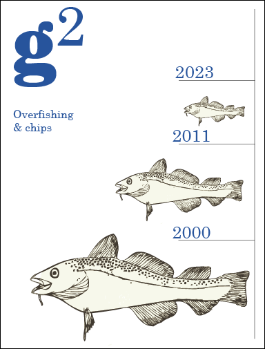
I began to play around with where they could sit on the page, how many there could be, representing their possible disappearance, numbers dropping.
A full page of fish, to a page where clear collums and structure has been eaten away at. There are clearly gaps in the design, literally, gaps where fish are being eaten too much of:
I really like how the type (over fishing and chips) sits on this particular page.
Playing around with different ways of communicating the topic through different imagery:


I thought about including the skeletons of fish, representing death, what is left after we eat the meat...


Here the fish is in 'Grayscale'. I don't think it works, I like the off-white colour that originated from my sketchbook.
I came up with Overfishing and Chips quite quickly, but thought about maybe making it clearer, or changing the word Fish to Bones - harsh.
and - 'n' (looks more like fish 'n' chips)
I think Overfishing and Chips works, I also spoke to Joe and asked his opinion and he liked the used of 'Overfishing and chips'


The use of white space, further experimentation:


I like how this one I have included one of the fleshy fish, I think it's good to have some sort of representation of an actual fish, to help express what we would be losing.


Swamping the logo with dead fish, I have looked at different covers of g2 and have found out that the logo doesn't always have to be in the top left. However I prefer it when the logo is in a specific place and the image works around it. I also think it needs to stand out and not be over ruled by the image.