Throughout this module I have made some good and bad decisions.
The software 'AfterEffects' was an exciting aspect of the brief, it enabled me to engage and approach a project with a whole different matter of communication. I was very excited at the start of this module as I have always liked on screen work, moving image has been a large part of my 'graphic design' passion. I looked forward to working with it and learning the appropriate software.
The 'Silent Movie' brief wasn't a brief I connected with very well, I didn't enjoy it that much and realised how bad I was at AfterEffects, it is quite a complex piece of software, I felt that the ideas I had couldn't be animated correctly because of the lack of skill I had on the software. I felt my short animations for the 'Silent Movie' brief were very average, they didn't really show much creativity and in all honesty, I'm not very happy with them. Although, this brief did help me learn a lot more about AfterEffects, with such a programme, I think practicing is what makes you understand it fully. I took notes in Mike's sessions, but the 'Silent Movie' brief enabled me to really test them out, and literally, get used to the basics.
It was a good start to the 'Top 10' brief, which I began to think about quite early on. Previously, I had made the mistake of thinking too much, too late regarding a brief, this time I wanted to get a head start and really knuckle down on this new brief. I was extremely indecisive for a long period of time at the beginning, which unfortunately lost me a lot of development time. I really want to be as decisive as possible at the start of the next module! I had certain random influences like, 'Danny Boyle' (Film Director), I did contextual research into split screen styles of working, and moving image, I very much wanted to use moving image/film in my title sequence. This wasn't part of the brief as I suppose the use of AfterEffects would be quite minimum.
Finally, I chose to do my 'Top 10' title sequence on the subject 'Daredevils'. This idea originated from a film poster, this seems like a strange way to choose a subject, and now, looking back, the wrong way to choose a subject. I felt I was restraint to a style of working and a specific layout and how I wanted my title sequence to look, way before I had done any development. I also focused a lot on music, to me, it was the most important component of the video, I was listening to tracks before I had even chosen my final subject. I wanted to work to aspects of the video (e.g music, style), instead of making them work with my chosen subject. However, I did a fair amount of storyboarding anyway, I was quite interested in my topic, I felt daredevils could be interesting to animate, the subject seemed exciting without any animation, let alone once fiddled with on AfterEffects. Further contextual research into what style I could do with my title sequence was limited, I was maybe too decisive when it came to the style of my animation. I became very fond of the illustrator 'Oliver Jeffers', I wanted to use him, be influenced by his work for my title sequence. If I were to go back, I would've experimented more with styles and layouts of my title sequence. I feel I was too indecisive at first in terms of my topic, but when I had I rushed my choices and did what I thought I liked.
I am pleased with my final outcomes, in the sense, that I think they look alright. The music goes well and is probably a main factor that makes it work. I like the style as well, the illustrative animated characters are quirky and were fun to create and animate. And overall, the set up of the whole sequence, how it flows works quite well, I like how I have only effectively used one set.
However, I think I should've done more research (storyboarding) and developing, I can't decide whether I think the title sequence communicates 'Daredevils' or not. My research into other existing title sequences shows that the title sequence doesn't have to relate to the programme that much, e.g 'Catch me if you can' - use of simple shapes, cartoon animations, worked very well. I also feel that my limited skill on AfterEffects was a problem, I was very slow on AfterEffects, and when my ideas were transformed into moving image, they never looked that good. Did I rely on my illustrations to communicated 'nicely' rather then on my skills on AfterEffects? Although, I am aware that the brief stated that technical skills involving AfterEffects that weren't in taught sessions weren't really necessary. My channel also changed very near towards the end, what was originally going to be shown on Channel 4, changed to E4, due to the target audience being quite young and spontaneous. I didn't incorporate much E4 within my sequence, and a lot more so with the Idents - is that normal though?
Maybe because I have watched my title sequence so many times, and the development work working up into it and throughout it was a little insecure, but my Idents seemed to flow a lot better. Looking back, they are very similar, at first I thought they should all be very similar, perhaps more development and designing could've gone into them to broaden the range?
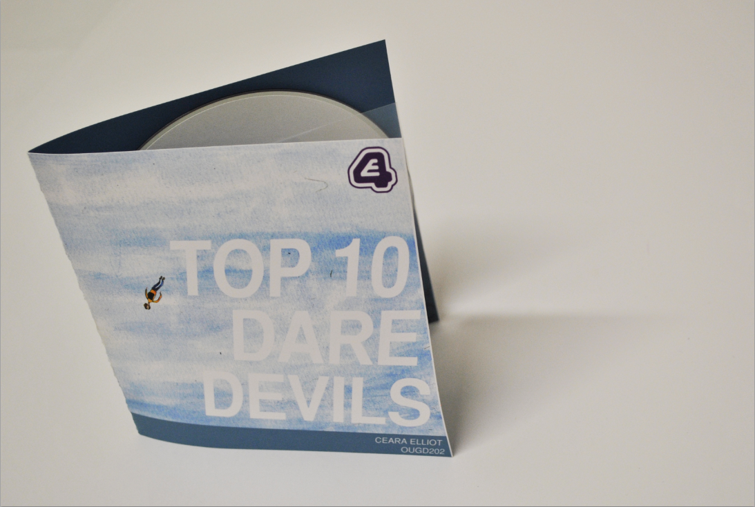
My packaging - much more thought went into the contents of it, what was seen inside, then the actual layout of it. I wanted to do something quite simple, but also effective. I did quite a lot of design development for my packaging, ideas regarding bits of thread with little men hanging off it, seemed a bit too arty and could easily look a bit naff. Clean cut, I wanted the packaging to be a digital and illustrative (to involve the title sequence). I was worried that if it was too illustrative it wouldn't communicate 'Daredevils' very well. The inside of my packaging is probably what I'm most happy with, but a lack of creativity and confidence has definitely effected the overall design of the packaging. I feel it's a bit too safe.
Perhaps I feel my whole project is a bit safe, lack of confidence on AfterEffects, and disappointment when seeing end results has maybe lead me to be extra simple with this module.
Overall, I am satisfied with my outcomes, however, if given the chance I would definitely do a lot of things differently. I have concentrated more on aspects of this module, more so then others that maybe I should've focused the most on. I didn't spend enough time developing my title sequence before I had distinguished where I wanted to go with it, by the time I had really indulged within the design process for this particular style of brief, I feel I had already limited room for creation/design.I have also discovered how much I love music within design, a good piece of music communicates something a lot better. I have also learnt that I do still like moving image, but prefer footage. A busy, information packed, stressful module, with aspects of enjoyment and times of regret. I would do this module again, with a different approach.