I have enjoyed the work I have progressed through and produced throughout this module. However, still, I have made some bad decisions, which hopefully I have learnt from for future reference.
YCN was a lot of fun, at times very stressful, but overall, our collaboration worked well.
We had doubts at first about working together for the second time, but I think we work well together. Our interests are quite similar, and especially for this brief, we managed to split up the jobs evenly which chopped the workload up nicely.
YCN gave me the chance to explore an actual brief, I felt I have to do a lot more research into the outcome because of the clients we would be giving it into. I wanted to ensure that our product would be successful as if it was actually going to be produced for real. This definitely intensified the prep work we both did, we spent a lot of time on the drawing board, but I think this was necessary. Our final outcome seemed appropriate and well thought out.
I really enjoyed the promotional piece of work I produced, it was stressed me out at certain points because I wanted it to look professional, I feel that it communicates the right message and the hard work paid off.
Sean was in charge of producing the packaging we designed, he wanted to develop further skills within the screen printing area, this was lucky for me because although I love the outcome screen printing has, I'm not that keen on producing packaging products.
As a pair I think we came up with a good product, well thought out, and we also managed to produce the packaging and a piece of promotional material to go with it.
Our collaboration wasn't that bad, a few minor disagreements, but as a whole, I think we work well together, I was pleased with our Pebbles.
WEB DESIGN, I found these sessions useful, I have been wanting to develop my own website at some point over summer, or next year as a way of documenting and showing my work easily. I knew nothing about coding before these sessions, now I know how to produce a basic website, with features like 'image rollovers' and 'lightbox' (image previewing).
I am happy with the website I produced for 'Root', I feel it communicates the best, there are a few things I may have changed if I had further knowledge of dreamweaver, but for the basic, essential knowledge we were taught, I feel it communicates the right information, and shows off what I know/understand. However, analysing my final website, perhaps it might lack professionalism, maybe in future I will design my website on paper first so it has a really professional structure and layout to it.
Unfortunately my website was converted into an Unix Execute file when I dragged it into the disc on a 'finder' file. This was VERY annoying, and caused problems, considering how the most satisfying thing about creating a website is when it opens up in Firefox and you actually see it working...
PRODUCT, RANGE AND DISTRIBUTION.
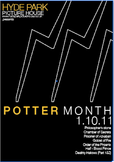
Made evident through the amount of potential briefs I had for this project, I was very indecisive again. However, the first crit I had, which was just a peer crit, discussing together as a group, was very useful. I managed to narrow down what I wanted to do, and come up with a purpose for my designing. I really liked the idea of producing a set of film posters, I have always been interested in film media so this seemed like an opportunity to have a bit of fun. However, I also knew how there had to be a range of products, so I thought about promoting, informing and decoration the Picture House for the event. I didn't really enjoy the leaflet and packaging designing aspect of this brief, I seem to like working to a flat surface, or 3D products that are impossible for me to actually produce. However, I learnt that drawing out designs on paper is a more successful way to design products, I feel my prep work for this project was a lot more in depth. The feedback I got from different aspects of my work were all so mixed for this brief, people said they really liked certain areas, where others said they preferred something completely different. I tried to blend both aspects together, seeing how that turned out, I suppose at the end of the day it's down to what I want to do, and what communicates best, both visually and technically. I feel I have made the right decisions for the film posters, limited edition posters and the ticket design. I would maybe improve the designs for the packaging, but I didn't take such a big interest in it as it isn't something I was that involved with. The cinema listings leaflet was printed onto A3 paper, instead of A2 which meant it printed very small, people have said it is still legible so it isn't a problem. I would've liked it to be bigger though. Overall I enjoyed this brief, however, if I could go back I would maybe choose a subject not as big as Harry Potter, it became problematic when choosing the right type, colours etc.. to communicate something so recognisable. I still enjoyed it though, it kept me stressed and thinking, in a good, productive way.
Next year, I want to be more decisive so I have more time do actually produce things. I would've liked to screen print at least some of the posters but I didn't have the time do them because I kept on changing my design ideas.
I really enjoyed working on promotional posters/film posters (potter), and also developing a product (green and black's).
A successful module I think in terms of learning and developing, although probably the most stressful.
Friday 27 May 2011
Thursday 26 May 2011
Wednesday 25 May 2011
WEBSITE FOR ROOT, final alterations
I decided to change the homepage images. At the moment I had half photographs, half images that could represent each designer. I think the images for each designer are better, they demonstrate the type of work we like individually, in a cheerful way.


each rollover image is the designers name, in a different colour, so that the name is legible, also I want the homepage to be bright and different, I basically see these four icons as a bit of imagery that viewers can interactive with a bit.
I thought this page was a bit dull, so I brightened it up a bit..


created a rollover, bright pink, keeping the viewer interested.
RE VISITING LIGHTBOX
I thought I should make the descriptions with more depth, at the moment I basically just named them. I added a brief description of what our company was asked to do.
code:
This is how it looked once you click on the icon:

WORK PAGE

I have created links to each of our blogs on the work page to show further work.
I also resized each of the icon boxes in the coding so that they are exactly the same size.


ABOUT page

I changed the rollover image from 'that works for you' (too cheesy), to 'personally designed'


Tuesday 24 May 2011


HP - final alterations after final crit
WEBSITE DESIGN.
Feedback I received about the webpages, were that the Dobby one worked the best and the others may be too distracting.
I agree with this now, I also feel that there should be one design for the whole month, the changing backgrounds might confuse people, I feel that I should definitely work further with the Dobby background.
I tried including one of the scars?
more than one?


I dont think the scars work as well as the Dobby image. The Dobby imagery is stronger, works better as an independent piece of imagery.

Do I need the text along the side?
NO.
I feel that the image of Dobby communicates enough, I feel that no matter how small I make the type, it still makes the website look too crowded. It's quite a busy website as it is, the main focus should be on the contents, the background should just accompany it in a subtle yet effective way.

Original yellow?

Brighter orange, used for the font colour throughout the website

Slightly lighter orange? not too intense.
I PREFER THE PALER ORANGE COLOUR.
ALSO
THESE ARE THE CINEMA'S SPECIFIC COLOURS. (orange not yellow)
RANGE WITH NEW COLOUR APPLIED


FINAL CRIT. feedback
Crit was alright.
Had some good feedback to get on with,
- re think website background (too clustered)
- minimalise boards more (some boards too clustered)
- descriptions of printing methods, stock, size etc on products I am going to propse
- am I proposing or producing limited edition posters, technically I am only proposing them because I'm not actually screen printing them, just printing them digitally
Monday 23 May 2011


HP - potter month webpage, temporary re-design
I have decided to temporarily re-design the website for the Hyde Park Picture house. I think it's appropriate not to design a whole new website, as their current website is known to the general public and there are sections on the website that enable me to advertise the event clearly.


This was my initial idea. I really liked the idea of using this image as a background for the website. I didn't want to change the existing website too much, I just wanted to have it so it was themed for that particular month.


adding info where it would be


Page with altered text and the background. I also tried including the text along the left-hand side, I'm not sure if this works, or whether it is even necessary or not?

Here is the text for the description that sits on the 'events' page.


completed events page

the link that is on the 'events' page, that takes the viewer to this page which I created. It's a simple layout, but it shows all eight posters available to purchase online or reserve to pick up at the cinema.

the poster with it's descriptive text (design for a separate page)

This is the page that you would locate to if you clicked on 'get info'. Small description, with the option to either buy online, or reserve to then pick it up
I had the idea of having the background changing on the days before and on the day of the specific showing. I used the imagery from the limited edition posters.


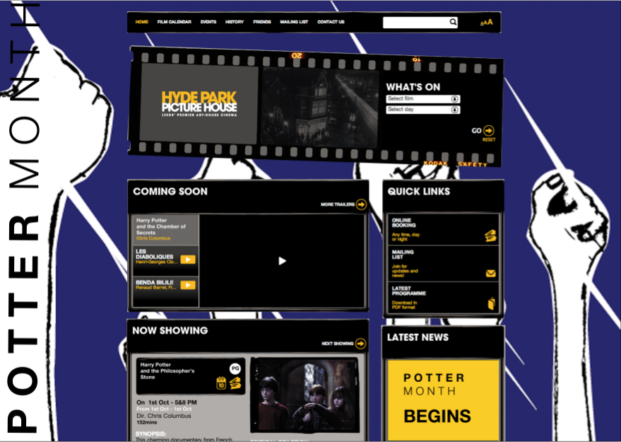

I do like these, I feel they are interesting and bright, and may seem quite exciting to viewers visiting the website. They also clearly demonstrate the different showings of Harry Potter.
ARE THEY TOO BUSY??
Subscribe to:
Posts (Atom)