Tuesday, 28 December 2010
AfterEffects, testing out ideas
Just an idea, pen clicking and revealing all of the word. Didn't quite work, the click's speed and movement needed to be perfect in order to communicate it better. It didn't fit right.
This doesn't relate to trying to communicate click, just shows experimentation with effects available on AfterEffects. It's just rotation.
Just experimenting with the 'shatter' effect.
getting used to AfterEffects,
Untitled .
I went with the idea of each individual letter falling and then bouncing once it hit the floor. However, when I watched it over and over again I realised that it did a better job communicating fall, then bounce. I can't rely on what the letters spell out to help communicate it. Also, when adding the video to the render que it didn't finalise properly so it cut off the last second of the animation.
Untitled .
This was an idea where I imagined the letters as little animals of some sort, just.. bouncing around? But the idea was a little dull and I felt it didn't communicate 'bounce' that well so, I scratched it.
Untitled .
I quite liked this idea, the large 'B' made my screen shot that little more interesting looking, and I also liked how the letters were all jumbled up so they did almost become shapes, the idea of a pinball type machine seems easier to communicate.
Untitled .
This was a simple idea, nothing special
Untitled .
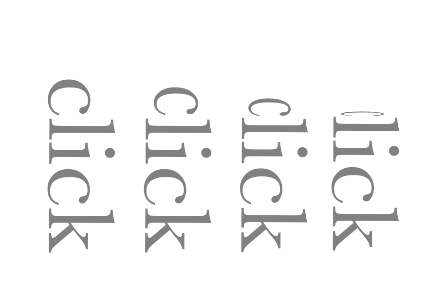
I liked this idea of a computer screen, the word 'click' being typed out, the keyboard being typed, clicked. I also used one of the methods on AfterEffects, where when you add a key frame you also add one letter, so it gives that look as if it is being typed.
This was quite simple, it was just a matter of stretching the word. I used the transformation effects that are available on AfterEffects, including skew, perspective etc...
This was just testing out using the opacity effect, I also added the effect to each individual letter, so each letter fades out (or in) separately.
This communicates 'stretch' quite bluntly, I just used the scale effects, widening and compressing the word, to make it look as if it is being stretched.
chewing gum stretch
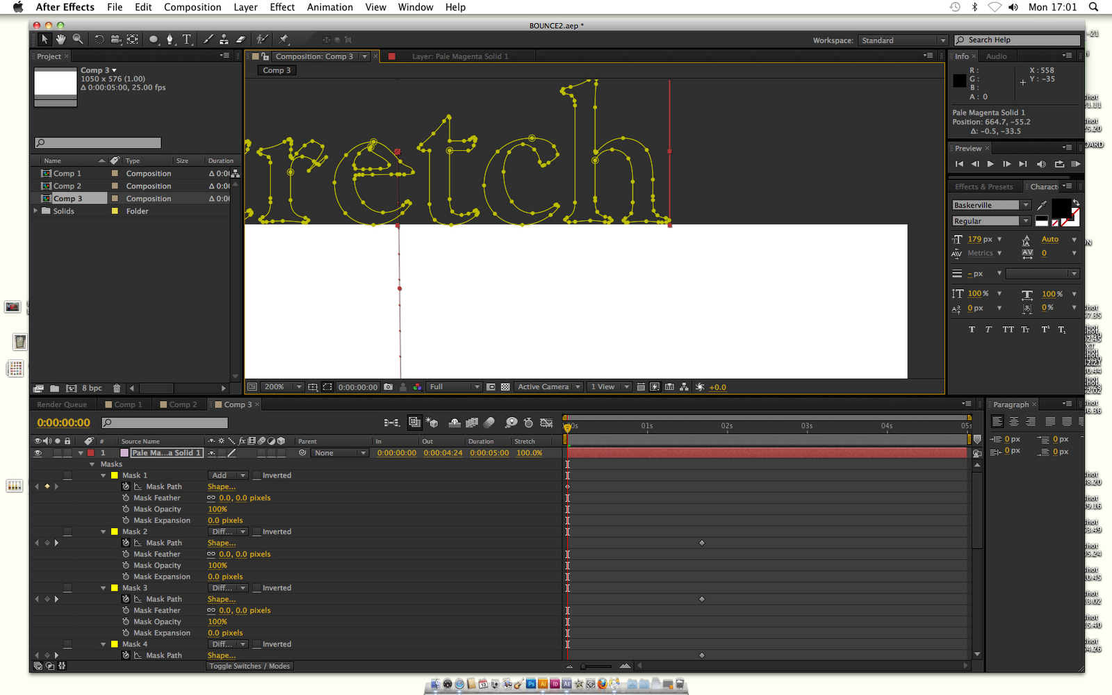


I asked Mike if I was able to create my chewing gum idea, it basically uses a combination of masks, layers and outlines around the type (which is pasted from illustrator). It enables me to individually choose anchor points and move them as an animation. I wanted to use them to stretch the word as if it was sticky, a bit like chewing gum.
This was just a rough video, as I got used to using the anchor points and using the layers/masks,
This was my chewing gum idea, finished.. sort of. I wasn't happy with it, I think the imagery I had in mind for this short animation didn't match up to the one I produced. It looks a bit too harsh and straight edged. I could visualise and communicate it better through Photoshop, but it was a bit harder on Illustrator.
development


chewing gum stretch
This was an idea I had to communicate stretch, I imagined it as a piece of chewing gum falling on the floor and then as if someone then stood on it, causing it to stretch off the ground being attached to the shoe.

button click
Once again, this idea emerged from using imagery. I could communicate click as being a pen top, clicking up and down?
Tuesday, 7 December 2010
after effects, playing with words (very basic)


second test video, using AfterEffects
Saturday, 4 December 2010
Wednesday, 1 December 2010
After effects, induction 1
First introduction into the software 'After effects'
I have used video editing software before, but only the basics, Final Cut has a similar layout to After effects. Also, like InDesign, images have to be imported:
If you want to start working using After effects, you have to open a new composition to begin animating:

PAL is a UK/American setting used for video/film/moving image, so when choosing appropriate settings for your new composition you have to choose PAL related settings. Also, because we will be using still images/photoshop images, they will be square pixels so we choose widescreen and square pixels.

Here you can adjust start and finish time (duration), and the colour of the background screen you would like:


To insert a shape to begin a moving image:


If your sequence is taking a while to render, (to render click the button on the very right where the play/pause buttons are), then you can lower the resolution:


I have changed the background colour and colour of the shape. Here is how you can make a shape move following a certain path. Click on the arrow where the shape's properties are, then click position, you can then drag the shape to follow a path:

Like Illustrator, there are anchor points you can adjust to insert a curve into the path:

Tuesday, 23 November 2010

OUGD201, evaluation
I have definitely learned a lot from this module, I feel it's been the first introduction into production outside of college work. The introduction of it which emerged from our chosen 'good' subjects, automatically made this module all quite independent, which I liked.
The inductions with Mike and Graham were very helpful, my skills on illustrator have developed therefore I was able to use it a lot more for my projects which helped a lot. Also, I became aware of some of the basic rules of type thanks to the sessions with Graham. I now know a little more about InDesign, and feel slightly more confident on producing a piece of type work, and it looking better than what I would have produced last year.
'Wrap it up' was a short and sweet brief, although panicked most of the time, I do work better under pressure. It was a chance to explore a variety of nets, and also learn the importance of an effective package. I was quite happy with the design on my work, but not so much the nets I chose. I feel they did work as a sold package, but I feel more research could've been done to choose something a little more appropriate. I think I wasn't quite sure on leaving my comfort zone, the nets I chose seemed easy, resulting in me being satisfied but not very much so. However, although I didn't use the other nets, I did learn about them and can use them for future purposes.
I started off this project (Design Production - Print) contemplating constantly about what I should finally decide as being my 'Good' subject. It seemed to be changing often and I was never completely comfortable with what I had chosen.
My 5 'good' subjects were originally,
- deep sea creatures
- family photos
- faces/mugshots
- piano
- film trailers
I decided to choose the catagory faces/mugshots, I feel I wanted to somehow work with mugshots/faces within my design work, as it is something I think looks effective independently.
I feel although this project started off slightly off-balance, my final subject continued to change, I felt that 'mugshots' was too hard to connect to a valued piece of design. Once I had properly thought about things it became something I could really indulge in, I decided that I would use the mugshots in order to design for a product. Ever since I have started this course I have wanted to incorporate photography somehow into my work, this seemed the perfect opportunity to do so.
My research into the varieties of print methods was interesting, and I found myself liking quite a lot of 'type' based design work, this through me a little off track but it got me involved in the importance of colour as well.

My research into the varieties of print methods was interesting, and I found myself liking quite a lot of 'type' based design work, this through me a little off track but it got me involved in the importance of colour as well.

Communicating a flavour through different colours and mugshots could be a way I could use my subject effectively? Questioning this option, it became aparent that my subject was no longer 'mugshots' but what I really liked from them, 'facial expressions' .
Even after I had finalised my 'good' subject, things still weren't completely comfortable, I started to branch out into using Illustrator to draw cartoon animals to communicate the flavours of juice.

Visually this looked quite effective because it was a lot different to your average design on a bottle of juice, however, after discussing it with Lorenzo, I felt that it was too unrelated, and that I needed to take the photographs and try my original idea, to use facial expressions to express the flavour. Once I had taken the photographs and edited them in Photoshop, using a 'duotone' effect I learned in one of Mike's sessions, everything seemed a lot clearer. My designs seemed to design themseleves slightly, then again it was slightly what I wanted, the facial expressions themseleves to do the advertising.

Visually this looked quite effective because it was a lot different to your average design on a bottle of juice, however, after discussing it with Lorenzo, I felt that it was too unrelated, and that I needed to take the photographs and try my original idea, to use facial expressions to express the flavour. Once I had taken the photographs and edited them in Photoshop, using a 'duotone' effect I learned in one of Mike's sessions, everything seemed a lot clearer. My designs seemed to design themseleves slightly, then again it was slightly what I wanted, the facial expressions themseleves to do the advertising.
This project really enabled me to get in involved with areas I had never reached. Although I felt confident in my work because I was dealing with photography, this sense of satisfaction was balanced out with a healthy dose of unsurity (which I feel helps work develop). I was able to really enjoy this project, which towards the end I did. I liked working with photography, as well as colour, and juice. It was fun actually producing an actualy product at the end, even though all the juices but one, are actually edible.
However, I still feel my levels of research have to increase? I feel it doesn't effect me so much in my work but I never seem to do as much as I should. Perhaps if I did more research, more of my project would more easily pull together and faster too.
My skills in Illustrator, InDesign, Print methods, and colour have all developed throughout the duration of this module. I really enjoyed certain aspects of it. After a rocky start, I feel during the last few weeks I have really endulged in it.
I want to start off as committed as I became these past three weeks for my next project, I think I was too lazy at the begginning and it became obvious how much more productive my work progressed into towards the end. Overall, a stressful, tiring module, but towards the end very enjoyable and informative. I have enjoyed it.
Thursday, 18 November 2010
final boards


My final boards.
For some reason I feel that the first two are a lot better than the others?
I am pleased with them though, I like how they are colourful throughout but also have structure. I didn't want them to be too boring, the colours loosen things up a little, make them visually engaging and also relate to the juices themselves.
Wednesday, 17 November 2010
juice bottle production and photographing

I had always thought about how I was going to make the juice the extreme colours I wanted. I had thought about food colouring, or photoshopping the colour, with added hue and contrast?
Turns out watercolours were perfect:

I tried to match up the colours perfectly to the colour that runs througout the label.
Even though the juice looks a little bright then your average juice, the type of responses I received were,
"Would be sweet if juice was really that colour"
"You're making me really want some juice""They look tasty"
Even though the bright colours look a little like paint, I think with the labels and the fact that the orange juice is actually completely natural, it kinda evens everything out into being, a brightly coloured juice.
Final shots.
These are screen shots of the photographs I took that I then edited slightly to use for my boards.

front view

side view, you can see the back of the bottle slightly

side view 2
Back of bottle


I am pleased with how my bottles of juice have turned out.
I was worrying about a few things, like how the labels would look as a set, the colour of the juice and also whether the labels would fit perfectly.
I think the labels balance out well, a large image on the front, is balanced with delicate, simple type behind.
I'm just hoping the juice doesn't look too much like paint.
Tuesday, 16 November 2010
SUDDEN LABEL DESIGN CHANGE.

These were how the labels were going to look originally. The layout of the label was inspired by the layout of the drink 'This water'.
When I was placing the image of the mugshot into the label, it came up a lot larger before I readjusted the size. Alice Vine and Ben Mckean said they much preferred the design when the face was larger. I agreed, so I decided to do this to all of the designs.


I did quite like how the two colours did go together quite well here, but I wanted to keep my designs consistent throughout. After trying the design out with all colours matching to the same pantone, I did actually prefer it that way.


Here I the labels all complete, on an A3 sheet, ready to print.
boards, first ones
I referred back to the sketchy piece of paper I got from Lorenzo during our talk about where my work is and where it should go. One of the discussions was about the boards, I found it very useful to do a few rough sketches of them first, to get a rough idea of the layout/design and also the contents.


The first board I think will have the bottles on it. A large, clear photograph to address my brief simply to the point, to get my point across. Also, this enables my first board to be colourful and eye catching. I want as little text as possible on each board.


Subscribe to:
Posts (Atom)