Thursday 25 March 2010

communication is a virus- prep work&final video

These are just some storyboards we put together to help visualise our video. We were going for a natural, authentic look, due to resources and limited knowledge of video at the moment, we thought it would be safe if we experiemented with our footage and aimed to create something that looked a little home made, a little rough round the edges.
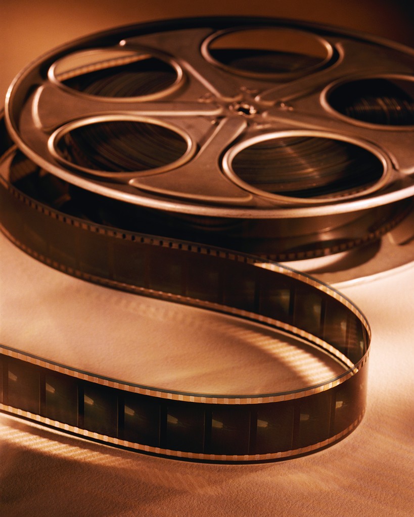


F I N A L V I D E O

This is our final video.
Our aim was to encourage people to read more, our audience was
roughly between 8 - 17. We were trying to express the adventure
and fun that reading contained. Our initial idea was running along the lines
of representing the 'yellow brick road' in some way, seeing as it was
fictional, adventurous and inspirational for young people. Filming in
natural surroundings, e.g forrest? woods? seemed our best option, and being
inspired by 'Alice in Wonderland', we thought of recreating our version of
some sort of path made up from books. As if it were leading to her future, or,
simply a representation of the amount of books there are. For advertising purposes
perhaps just to draw people in, presenting our audience with an interesting,
slightly odd visual of a line of books.
Our original song we decided to go with was 'Like a Rolling Stone' by Bob Dylan,
with an idea of how the video was going to look, the 'home video', almost
vintage style really worked with this particular song. However, after a crit, it was said
that the song wasn't appropriate for this message we were wanting to send out, and
also our audience. The lyrics were actually very cynical and did not communicate
well. This was pretty unfortunate because the tune itself worked well with our video,
we then looked into finding a new song that would work collectively.
We chose to use 'Here comes the sun' by The Beatles, a classic song, that immediately
creates a happy atmosphere. It approaches our audience effectively with
positive connotations, peace, happiness and warmth. This is what we were trying to
communicate through the 'joy of reading'. It turned out, this song did actually work
well and the fact the last shot is actually of the sun, links nicely.
The style in which we edited the film, was done in a way to express playfulness. It
isn't serious or dull, we made it look old and rustic as well as adding a warm filter onto
it, exaggerating the sun. It almost looks like a home video, but secretly filming,
almost as if it could be escaping into the girls imagination.
I really like how it has turned out and hopefully it will persuade young people to give
reading more a try. Hopefully it could also attack those who just sit at home and watch
t.v, it could suggest the idea of reading a book outside, and communicate it as
appealing.
I am glad we chose to work with video, Sean wanted to work using film, and I was happy to
do the same. I found it an effective way to explore our aim, and also coincidently targeted
those who perhaps needed to read more, as they would be watching it on a screen at the time.
I also think, after researching a number of existing advertisements, that a good advert actually
can change and influence someone very well. If it is interesting, with good music, normally
it is memorable, therefore could have an impact.

Friday 5 March 2010

Book - A is for...


My 20 books- I was influenced by 'The Very Hungry Caterpillar' book, the illustrative style and the overall concept of the book. I thought I would just go with a simple theme and focus on it, typically 'A is for Apple', I decided to draw different apples, and to have it slightly more crisp and 'graphic' I would have a few typefaces cut out of each one. The idea that there is a worm creeping off at the back suggests he is the one that has eaten out the letterforms, this keeps the book sort of playful, but could be seen as a type of stencil? Maybe a mini 'a' typeface library, but that might be milking it a bit. I chose to use a worm because I didn't want it to just become another, smaller, apple version of the caterpillar book, I used it simply as a starting point. Also the book is quite small, and so are the apples, so the idea of a little worm seems to work better than having a big caterpillar crawling across the page.
I was able to squeeze in a slot after college to use the lazer cutter, this was very useful, not only is the lazer cutter unbelievable, it also makes mass production easier, quicker and a lot more professional looking. Learning from my previous project where I hand cut out the word 'see' on my dvd cases, I now know the difference between the two and how much better lazer cutting looks.
I used a stock called 'off-white', I felt this coincided with the colouring pencil/crayon effect illustrations, I also like how the lazer cutter has slightly burnt the paper where it has cut, this sort of looks like it has been eaten/cut by a little worm. The stock was the right thickness to fold it properly, but not too thin so it looked a little loose and floppy. I wanted to print onto a slightly coloured stock anyway, like a beige/yellowey colour, so this stock matched what I wanted perfectly.


I was so impressed with the lazer cutter, I definitely plan to use this equipment in the future.

Tuesday 2 March 2010

what is a line?


'a formation of people, objects or things on besides/behind the other'

fruit stall- the fruit is lined up, stacked up, in an ordered manner

Que of people - people are lined up behind each other


'A connected series of events, actions or developments'


return train tickets- I like the idea how they are a connected series of events, you use both of them to get you from A to B. The travel itself could also be considered as 'line'


'A mark indicating position, connection or boundaries'


Waves- mark a position (shoreline) and a boundary, they are where the sea meets land, they indicate a clear natural line


Train tracks- I was on the train the other day and I took some footage of my view, I made sure I kept the window frame in the image (the constant line). I like the idea of 'travel' as a type of 'line'.

Monday 1 March 2010

A is for...


start...

In design, Jo

The Brief-
A3 spreadsheet containing info on Jo Catlow, images and 300 words

Considerations-
What I want to focus on, specific or broad? One interest for Jo, or her life as a whole, or maybe other opinions? Layout/type/image/colour

Target Audience-
colleagues?

Tone of Voice-
relaxed, cheerful

Background-
Learning how to use InDesign, exploring layout and how spreadsheets can be presented

Mandatory requirements-
broad range of visual investigation form of design sheets and notebooks, final image double page spread, portrait A3 stock (237x380) (2cm bleed)

Deliverables-
One double page spread

Studio Deadline-
27th May 2010