Friday, 26 February 2010

VOGUE, salut


These are a selected few of my posters, I think my favourite is either the last one simply because of it's simplicity, or the third one. One of my words that I specifically focused on was 'French', it was something I instantly thought of when 'vogue' was mentioned, and I also liked the idea of producing a poster focusing primarily on another language?
I researched into the French language a little further than GCSE, in terms of translating poetry and phrases. I wrote a short poem that is printed across the poster, and the phrase repeated in most of the posters translates as 'I am someone, but who?'
I chose the colours blue and red because they are the colours of the French flag, I also think they work well together.
Other designs I did were quite different, I produced others with slightly more colour but didn't really like them as much.


Although I originally stated I was aiming to communicate clarity through my posters, looking over mine now the fact they are in the other language obviously isn't very clear. I was aiming to communicate a sketchy type of look, as if people always seem to want what they don't have, picture themselves differently then they actually are?
In a way i'm approaching quite a deep, serious matter, but I would still like to maintain the quirky, arty, interesting type of look with my posters.

Wednesday, 24 February 2010

Thursday, 11 February 2010

final, product&packaging


I produced the packaging properly, I wanted to go for the simple look because I felt the intense eye colour, pattern would be enough for the packaging. I didn't want too much going on. I realised that the video was mainly focusing on pupils dilating, not just eyes themseleves, therefore, it would be effective to somehow relate the cover to the contents of the dvd itself. I used one of the facts that were in my research, this would draw the viewers attention as it may be something not everyone knows, or pays attention to. This would then lead on to the video itself, one hundred seconds looking at dilating pupils.

I feel this packaging worked better than the last because of its precision and cleanliness. It looked more sharp then the previous packaging, I wanted the packaging to be quite simple because if the film itself were to be distributed, it would perhaps slot into a newspaper, or just be posted? Nothing too large or complex, the complexity is in the short film.

Monday, 8 February 2010

dilation

I need to focus on eye dilation, to design and create a new packaging, I will target the overall footage itself.

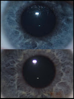
"The eye dilates up to 45% when it sees something pleasing"

The video

The link:

The video:

Friday, 5 February 2010

using final cut

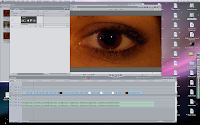
screenshot taken beginning of video making process.

This was my first time using Final Cut, I incorporated video and audio and almost produced a bit of a remix. My aim was to have the dilations relate to the beats of the music, this meant I had to chop up the song and place it at appropriate areas with the video. I also had to render the video itself, the original was 7.40 seconds long, so I had to cut it down to 100 seconds. I chose the best dilations and reversed each cut and placed them back to back to get the repetition.

I also used another video software called, 'After Effects'. Once I had finalised the raw video and the music matched up to the video I then was able to export it into this other software. I was able to use filters like, 'vignette', this focused the main point at a certain area I chose, and then fade out as it reached the border. I also was able to enhance contrast, curves and certain colours.

I am glad I have learnt how to use all of this software, I enjoy working with video.

product&package


This is an example of one of the dvds and it's packaging. I was unable to lazer print onto my white card to I had to cut it out by hand, I don't think it looks that bad, but I would've liked to have it looking more professional. I wanted to have quite a pure case, all white. I felt this would compliment the dvd because I aimed for simplicity with the dvd cover and packaging because the film itself is quite extreme.


MOCK UP.

disc-print


My dvd case has the word 'EYE' cut out on the bottom half of it, this enables 'one hundred seconds of eye' to be seen when the disc is in it's package. I also thought with this design that the image of half an eye could be self explanatory? I produced 10 versions of the design, all different shades of eye colour, I feel 10 is a safe number, and also a multiple of one hundred.

Problems:
  • Towards the end the disc printer crashed so a few of the prints are not as clear as the others
Problems occurred regarding the product overall:
  • Audio was only enabled after copying the sixth disc when the video man realised
  • The file is too high quality to play off the disc itself, therefore you have to drag the file onto the desktop for it to play smoothly. The disc, is more of a memory stick for the short film.

Monday, 1 February 2010

One hundred - focus, in focus, the eye itself


What I find most interesting?

I'm creating a short film (100 seconds long) of a collection of eyes, dilating to a piece of music. I can envisage an installation for certain events like 'Lights night', where it would be projected onto a building/large wall and played on repeat?
Quite an arty thing, it's purpose is basically entertainment, hopefully viewers would find it interesting?

eye colours, out of one hundred


People have,

45% - brown eyes
34% - blue eyes
21% - green eyes