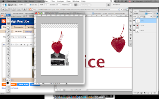
Some fonts I like. I think it's best to use sans serif, although I will know properly when I apply these to a design. I want a really simple font, the image (face) should be more important because it relates more to my 'good'. The sans serif fonts normally look a lot more simple, I especially like 'Orator std'. I'll test these out with context though when I design.
Sunday, 31 October 2010
design
Just a few very bad mock ups of possible areas for where my design to be promoted? I like the idea of the design being quite large scale. The design I have used isn't final at all, I'm not sure how the design could somehow link to the way in which the product is promoted and also packaged?
Rough sketch of an idea to package&promote, strong plastic tubes placed around the city, a bit like chubby lamp posts, but actually act as a type of vending machine? Easy access to the bottles of juice, that also stand out to others in a shop/supermarket?
It's just an idea at the moment, a very rough one.
Thursday, 28 October 2010
Juice, testing designs
Photoshop, making images printable colours,
RGB - CMYK
This image is RGB, it is used for on screen viewing, like websites and blogs etc... However, when it comes to printing, it is usually recommended that your image is changed into CYMK. This is because the brighter colours can't be printed.
This is image when it has been changed to CMYK, you can see it is slightly duller because the colours aren't as bright as when they were in RGB.
You can see how your colours will change, but going to 'View' then 'Gamut warning'. This enables you to see the areas that will be printed differently because they are too bright to be printed out. Once you have viewed the 'gamut warning', you can change the colours manually by adjusting the saturation/hue.
Thanks to the photoshop workshop with Mike Flowers, I learnt how to make an image duotone, tritone and quadtone. When I was mapping out and visualising this design in my head and on paper, I had the idea that I wanted the photographs to represent the flavour of the juice through the facial expression, and also the colours.
Perfect time to use duotone.
Here is the image, that has been changed into CMYK.
Once I have gone to 'Image' then 'Grayscale', I think go to the same menu but click the option 'Duotone'
You then have the option to change to either 'duotone' (two colours) tritone or quadtone (three or four colours).
You are also given the pantone reference for printing reasons and also to help you reference the colour again. It's also good for using spot colour to get a good shade of colour.
Testing out 'duotone' to my initial rough designs.
Tuesday, 19 October 2010
wrap it up, feedback
In my group I got 11 votes for the category, 'Best use of Type and Image'. The comments I received were:
- Really nice use of colour, striking imagery
- Fantastic colour choice, good scale for the poster
- Great use of colour and stock
- Colour and stock are visually engaging
- Great stock and colour choice, the composition looks good too
- Very well done
- Colour looks great on the stock
I am happy with this feedback, the comments I received are complimentary and I did enjoy producing the work. I do like the image&type on the poster and little straw envelope, with the right audience I feel this does have potential to promote a product. For the box, I like how the strip that you rip off to open it, is patterned with strawberries.
However, I am disappointed in myself for not perhaps using the print&packaging element well enough? I didn't get any votes for 'Best use of packaging nets' and 'Best print considerations'. I know I could've done better. I feel that I spent a lot of time on what I was packaging & why, the design, colours etc... that I abandoned the brief's real intention. I spend too much time thinking about what I could package, I should've chosen a word and an image more chaotically and just had fun with it.
Some of the final products were very impressive and showed great amounts of creativity.
photos uploaded soon
wrap it up, thenet
Final net for the box package, I chose the colours, red relating to strawberry and the cream colour to help represent a clean but also slightly organic feel? Also I had thought that the stock I would use for the other prints would be newsprint, to communicate a bit of authenticity? This way the stock and the colour of this net will link nicely.
Chosen typeface, 'News Gothic MT'.
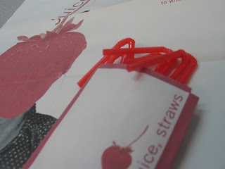
Final poster, onto newsprint. Little bit of informative/persuasive text to make the poster more purposeful regarding the juice package.
Photographs of final:
Photographs of final:
Wednesday, 13 October 2010
wrap it up,testing out packaging
1.
2.
3.
4.
5.
My 5 mock ups for different methods of packaging. I have chosen to work with 1, 2 and a fold out poster. I might actually put the fold up poster and the actual product inside the cylinder type package (1), and have number 2, as a stand up flyer to advertise the product?
----------------------------
Designing...
This packaging is perfect for containing other forms of print&packaging.
I had the idea that I could use the packaging to promote the new range of juices? A different way to sell the product.. would it be noticed as that?
I wanted the package design to be clean and crisp to help communicate a healthy, refreshing drink? To enable strawberry to be shown somehow I thought the pattern could be inside the box?
-----------------------------
PINT GLASS&STRAWS&POSTER?
I then decided to change the contents of the 3D package, I figured that people wouldn't clearly see that what I was trying to sell was a bottle of fruit juice. There are ways to promoting/introducing a new range of juices into the market, I thought about the freebies that could be given out alongside the bottle of juice? The box would now contain a pint glass, a promotional poster and a envelope of straws (colour linking to the flavour, red).
chosen nets...
?
design?

Linking my work with my original 'good thing', mugshots. I thought this was a quick easy design that could easily attract people to the product. It seems so simple, combining a strawberry and a mugshot... works quite well though?
image?
word = juice
Combining the image and type, playing around with layout. I didn't want to type to be too big, as the image is quite striking and in terms of promoting I would rather have the image large than the type. Juice running up the stem seemed the best, it stays close to the image so that the two obviously link, but isn't too overwhelming.
Subscribe to:
Comments (Atom)


