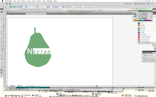
I can't work with the fruit! type only,
Talk with Lorenzo,
After I had a small chat with Lorenzo, I left with a clearer head of what I needed to do and tips on how I could do them. These sketches were rough ideas of how I could plan out my boards, what was to go on them, and the type of layout that would be ideal.
I had definitely been having problems with the logo, the advise of sketching a few down on paper roughly first was useful, and made it easier for me to start designing them a little better to see which ones worked best.
Rough design sheets:
Out of all of them, the idea of using a circle seemed best to use. Not only did it relate to some of the design context I had liked relating to logos (circular), but also, my idea of having the logo on top of the bottle cap, made the shape fit perfectly.
I tested out more than one though:
I thought that using circular shapes would be relevant, as I had visualised it being also stamped on top of the bottle cap?
Here I was going for simplicity, the little 'o's were there to represent the seeds of a strawberry, but also become the form of the strawberry itself.
However, I felt that this block colour strawberry had more of a better effect, and balanced out the logo well. I also like how the logo seemed pretty versatile, it could be a stamp?
From opinions I got, the line thickness of the circle should've been thinner, I agreed as it made the type stand out a bit more.
I experimented with using all of the fruit shapes, just as block colours and shapes.
I think these work in black and white as well, I checked this just in case through production they had to be black and white for some reason. I like how these look, I think they would suit the design of my products.


No comments:
Post a Comment