Outside, design experimentation,
I thought that my original design wasn't very bold in any way that it communicated daredevils. It may be because of the painted background, but this relates to my title sequence, and also the image printed onto acetate. I thought about having the title of the dvd a lot larger, which not only would take away some of the space where the background is, but also communicates it as a bigger,bolder subject.
The sky, although looking alright, seemed a bit pointless. It is used in the title sequence to create a scene for different characters to show their ...stunts? I thought that including a little figure could prepare the reader/viewer a little for the contents. It also gives the sky a purpose, as is he falling through it. Where to put him?
I thought about having him in front of the 'D' as it keeps the text&image all in a square, neatly arranged. Does it look like he is falling though? Or part of the text.
It is between the last two,
I think the bottom image seems to be the most appropriate. I also got some feedback and people also said the bottom one.
I think,
- Looks more arranged, fits as a group
- It seems as if he is falling because he is detaching from the type more
- He seems to be more involved, making him understandable in the context
Outer cover for DVD package.
LOGO, channel representation?
I looked at some e4 dvd packages and the logo is on them, in the corner of the page normally. I would like to change the purple colour into a blue colour? Although this might make it harder to distinguish it as the e4 logo? Purple is it's identity colour.
ACETATE PRINT & DISC PRINT
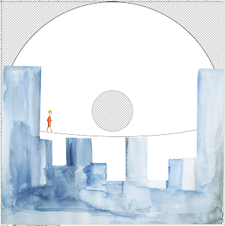
Scan of my watercolour skyline, bluey, grey colour, simple blocky shapes.
If the disc was inside the packaging, behind the image printed onto acetate.
The skyline seems a bit too blobby?
Straighter edges, I think the watercolours are vague enough, I don't want the design to be too floppy. I used watercolour to keep the design and sequence consistent.
I that the two buildings that covered the wire not only impaired the visual impact the wire had (easily communicating the man walking across the wire to the other building), but also implied that they were further away which would mean that the wire would have to go in front of them. The disc will sit behind the acetate which means it can't be in front of the image.
MEASURING.
Type on disc,
When this disc is behind the image, I think the man is too low down, you can't really see much height (which makes it more daring).
Type on disc,
The type is going to be situated quite low down on the disc, so when it is slotted behind the acetate you can't see it. I added a bit of gradient to the colour of type, I just individually picked colours ranging from a dark grey to a blue colour similar to that in skyline. I thought about having this, so the dark grey isn't too harsh, and also the skyline's colour varies quite a bit.
Text too small?
I made the text a larger, the perspective is obviously not right, but I think the large text is a bit pointless.
FINAL PACKAGING
AND DISC PRINT DESIGN.
Outer package
Disc print
Acetate print
When disc is behind the acetate print


No comments:
Post a Comment