
Brush script
I don't usually like using really animated typefaces, but the hand written style does look alright with my illustrated style animation.

Britannic Bold
I like the idea of using a bold font to help communicate the subject (dare devils) better. It seems like a daring/blunt typeface. However, does it compliment the illustration well?

Birch Std
I like how this font is condensed, I think it is bold enough but not too big that it looks too much? Could work.

Century gothic
I don't really like this anymore, I thought it worked well at first because it seemed to be the complete opposite of the illustration? Which may actually compliment it? Now looking at it... no.

Chalk duster
Just increasing the variation really, the chalk doesn't link with the water colour style, but the hand written effect again works nicely.
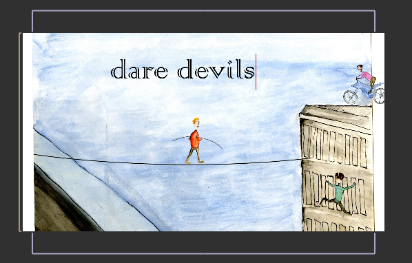
Colonna MT
I think the detail in the type links to the washy/sketchy ness of the illustrations?

Copperplate gothic
Good amount of boldness, also looks quite

Mistral
Once again, hand written- think I prefer this to 'Brush script', not as thick, but dark enough. Legibility will have to be considered though

Orator std.
Maybe looks a bit too digital ? Not sure

Kozuka gothic
Thin - good
No comments:
Post a Comment