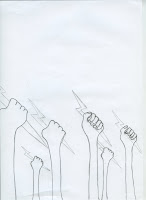
I drew out the posters I had thought about producing. I figured this way would be easier, I wanted them to be more authentic then the ones I tried producing immediately from illustrator. These looked too perfect. I think the drawn aspect would be more effective, it also gave me the chance to play around with the imagery in a more free hand way.

This is the poster idea for the Philosopher's Stone. It originated from the idea that Voldemort was underneath Prof. Quirrel's head turban.
An idea for the Chamber of Secrets. When I had my progress crit, layout was mentioned, I thought about the variations of how the snake could sit on the page, and I think the vertical lines communicate the idea of a 'chamber' as well as being visually attractive and bold. The two scars appear as the snakes forked tongue.
 This was an idea for Goblet of Fire. I wanted to focus on the competition element, seeing as that is a main aspect of the film/book. I thought the fins entering the page from the side not only appeared interesting regarding the layout, but also were a clear indication of what Harry becomes for an element of the film. The four scars will be part of the fin, separating the toes etc..
Order of the Pheonix. Prof. Umbridge plays an important role in this film, I wanted to base this design around her. There are also elements of smashing/breaking glass that occur throughout. The five scars have become the cracked edges of the tea cup.
Deathly Hallows Part 1. DOBBY DIES.
Half Blood Prince. Dumbledore dies, very significant part of the film, they all hold up there wands as a sign of mourning, I thought this would be a nice piece of imagery, I had included the six scars as the wands they are holding.
prisoner of Azkaban. solid image of a werewolf, the teeth will become three scars
Another idea for Prisoner of Azkaban, the imagery of the death eaters mask, the three scars being the gridded teeth holes.
Deathly Hallows pt 2. This film focuses on the battle between Harry Potter and Voldemort, I wanted to show this through the poster. I have used half of Harry's glasses, and then Voldemort's eye. I may include the scars down the middle, or intertwined throughout the design.
WEREWOLF, simpler version.


No comments:
Post a Comment