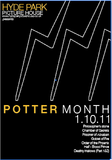
Feedback I received about the webpages, were that the Dobby one worked the best and the others may be too distracting.
I agree with this now, I also feel that there should be one design for the whole month, the changing backgrounds might confuse people, I feel that I should definitely work further with the Dobby background.
I tried including one of the scars?
more than one?
I dont think the scars work as well as the Dobby image. The Dobby imagery is stronger, works better as an independent piece of imagery.
Do I need the text along the side?
NO.
I feel that the image of Dobby communicates enough, I feel that no matter how small I make the type, it still makes the website look too crowded. It's quite a busy website as it is, the main focus should be on the contents, the background should just accompany it in a subtle yet effective way.
Original yellow?
Brighter orange, used for the font colour throughout the website
Slightly lighter orange? not too intense.
I PREFER THE PALER ORANGE COLOUR.
ALSO
THESE ARE THE CINEMA'S SPECIFIC COLOURS. (orange not yellow)
RANGE WITH NEW COLOUR APPLIED


No comments:
Post a Comment