COMPOSITION
TYPE
HIERARCHY
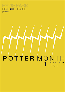
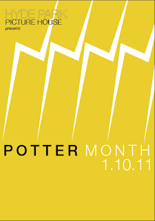
After my talk with Fred, another thing brought up was the use of the tally idea with the scars. It looked too much, and didn't seem to work. Fred suggested playing around with just using the scars, in a line, by themselves, however really,
I have used the yellow colour that the picture house use in their logo, keeping the relevance and also the colour acts as an attraction too? I still want to keep the designs quite simple, limiting the amount of colours I use. This will also relate to the colour restriction I will probably impose regarding the individual film poster designs.
Only using one strike. I do actually like just using one strike, I think it focuses the viewer more on the subject of the poster. The yellow background also seems to give the poster a better more unique feel. I have also made 'picture house' slightly more obvious than hyde park, simply because 'picture house' communicates a theatre/cinema a bit more than 'hyde park'. The combination of the three textures for each bit of that text, creates a bit of texture as well.
WHITE on BLACK only. Think it lacks communicating the picture house, although the event is 'potter month', I think there should be a small relation to the picture house.
yellow strikes. Yellow strikes look a bit too much like a lightning bolt?
I like this one. Colour difference between 'potter' and 'month' gives poster depth, perhaps try it with a yellow background?
I like the playfulness that the one strike seems to communicates.
---------------------------------------------------------------------------
DONT LIKE YELLOW STRIKES, seems a bit too much like a lightning bolt and also seems a bit too much
-------------------------------------------
----------------- - - - - - ----------------------- - - - -------------------
CHOSEN POSTERS (there will be a variation)


No comments:
Post a Comment