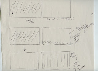
FRONT ---- BACK
I want the loyalty card to be quite simple.
The scars could be embossed (represented on the design as a lighter shade of the yellow), and maybe a hint of branding on the back? I thought about just using 'Potter Card', with the same typeface used throughout the posters.
The stamp will be shown with an actual stamp that will be printed, so if each scar gets stamped when you go to each film, then surely it is self-explanatory that you don't need to label each film individually?
IDEA TO CARRY FORWARD,
I like the film strip idea, I think it links to the film aspect and also, keeps the simple design I wanted. Having the clipped areas on the edges also avoids interrupting the underneath of the embossed area.
before
after clipped all films,
this would be the card, if the viewer hadn't gone to see all of the films. I still think it works, the perfect shapes linked with the mustard yellow colour seems to keep the overall card quite authentic and a piece of small design.
TYPE? BLACK?
black line? split up the yellow colour?
FRONT VARIATIONS.
I don't think the numbers are necessary.
SCARS - for identification/branding purposes as well as texture and also related imagery.
clipped holes - a clean way of stamping? By taking away aspects of the card, you are left with, what looks like a strip of film.
THINK BLACK LINE?
for decoration purposes, balances out?
EXPERIMENTING WITH EMBOSSING,
There were some difficulties with embossing, the 8 scars were too finely detailed to actually look good when I embossed. I couldn't reach the small corners because they were too thin.
I went and spoke to Caroline and asked her whether the press in screen print could emboss it. She said I would have to do it with the heat press down at Vernon Street, she also said that it would be better if I had the pattern cut out from thin wood or mount because the details were very fine.
NOT MUCH TIME.
I am going to see if other designs, which make embossing it myself work, work with the design of the card. IF NOT, then Vernon street?
OR SPOT VARNISH?
OTHER DESIGNS
I LIKE HAVING ALL OF THE 8 SCARS IN A ROW
I went and spoke to James in DIGITAL PRINT. He said that I can spot varnish onto satin or gloss paper, keeping the part I want to spot varnish on a separate layer and also the RGB part all 253.
The spot varnish could also make sure that the loyalty cards are real, not fake.
Black blocks alongside the bottom and top on the back of the card? Or just yellow?
DOES BLACK GIVE THE CARD A MORE INTERESTING LOOK OVERALL?
I was concerned that the clipping rectangles out of it would be easy to copy/fake. I spoke to Amber about this, because I don't want the design to be changed due to the worry of people cheating... so it isn't really my concern. I want the design to have rectangles clipped out, for designs sake.


No comments:
Post a Comment