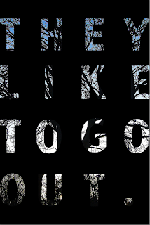
Image I am going to use, it's a photograph I took of a tree during a summery sunset (for some reason there weren't any warm colours)
Different type layout,
Trying out different fonts
I like this font (last image), and I also like the spacing inbetween the letters. I got some feedback about having them all lined up in rows of 4 and 4, I could include a full stop at the end of 'out' to do this.
Testing it with colour, feedback I got was the solid mustard yellow, white and black looked best.


No comments:
Post a Comment