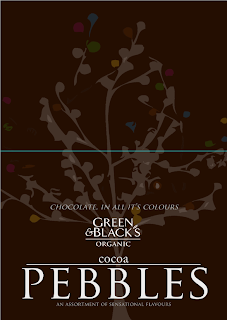
- Description for Pebbles
- Imagery used, tree necessary? appropriate for the packaging?
- Colours, (regarding packaging mainly), should be dark brown, not dark grey
- 'Cocoa Pebbles' to represent what they are more clearly
Does the promotional material have to have dark brown backgrounds?
IMAGERY RELATING TO A STRAP LINE?
I thought about using imagery to relate a strap line appropriately.
The description for the product is,
"An assortment of sensational flavours"
I want to communicate this, but in a more creative way that also was supported with an image that showed the product as well.
"An orchestra of flavours"
Orchestra seemed to fit to express the 'assortment' side of the description. It is quite sophisticated, and portrays an essence of beauty and class, I think it's the relation it has with soft, classical music. Represents quality.
I also strayed from the 'colours' aspect of the product, I think it is the flavours that are more important to express, it is what Green & Blacks are proud of as well.
Should the flavours be shown?
I thought about the layout of an orchestra, the pebbles being the orchestra, and the type below it representing the stage & audience. The type could also act as boundary that enables structure and layout to the design, and also clarity of what I am trying to communicate.
Change background colour?
White is quite clean, preferred to dark brown? Does it communicate the richness and intensity of Green & Blacks.
too bland? I think an image of the product is needed
PHOTOGRAPH CHOCOLATE.


No comments:
Post a Comment